


ScreenFonts: Iron Man 3, The Happy House, Kiss of the Damned, The Great Gatsby


Damage to my internal hard drive in early June, which coincided with my trip to Istanbul for ISType and a tampered-with Apple Time Machine, caused me problems for almost three weeks. Regrettably these setbacks made me fumble last month's ScreenFonts. Let's play catch-up on some Spring movies and move on straight to the Summer releases in the next episode.
Branding with type works on various levels and in different media, and movie collaterals are no stranger to this. The teaser poster for Iron Man 3 continues to build upon the same visual strategies I originally noticed in the promotional campaign for Spider-Man 3 six years ago. Just like in Spider-Man's Mata, the number "3" set in Armada rendered in beveled metal is so recognisable it is not even necessary to show the actual logo anymore.
This limited edition one-sheet was available exclusively to attendees of 12:01 IMAX shows of the film on May 3rd. IMAX has long given out special posters for select midnight screenings, and with this poster that tradition is coming to an end. It was designed by renowned graphic artist Jock, someone I only knew from the comic book world. I asked Jock how he made the transition to film poster design.
Jock | "Over the past few years I've increasingly got approached by studios to work on aspects of film campaigns, but I guess I've become better known for it since I started collaborating with the guys at Mondo. They're just the best to work with and a few of the more mainstream projects I've done – like the Iron Man 3 poster – came through them."
How was the interaction with the client?
Jock | "I enjoyed a lot of freedom. You pretty much get complete freedom working with Mondo (so long as it looks good), so Disney and Marvel were happy for me to just play around and come up with a number of different ideas. They liked my Shaun Of The Dead poster a lot and kept referencing that, but not a whole lot from that came through in the final piece. The only strict direction was that they were keen to show the different drone suits that appear in the third film, to set the image apart from the other movies."
It's great that you reveal 9 unused designs on your website. What decisions led to the choice of the final poster?
Jock | "I was flying to Dubai and my flight had been mistakenly booked a day early, so all of those designs were done in one long, productive day. I was trying all sorts of different ideas – I think it's important not to limit yourself in the conceptual stage – but ultimately they chose a more graphic approach rather than a design which could be read as regular campaign art. I think film makers and studios are increasingly seeing the benefit of working with people like the guys at Mondo and individual artists – they offer something unique that people seem to have a real appetite for. It's great to see and be a part of."
The very seventies poster for The Source Family sports the striking multilinear display face Prisma. Originally released by the Klingspor Foundry in Offenbach am Main in 1931, this design by Rudolf Koch consisted of the basic capitals and figures only. Until recently it was only available in digital format as a freeware font of dubious quality, yet two years ago Ralph M. Unger revived and extended this eye-catching headline face. The chubby rounded serif face at the bottom is Worcester Round. This design inspired by rural English and Anglo-American life in the late 1920s was designed by Adrian Williams in 1974.
ICO – the national support organisation for independent exhibitors of all kinds including cinemas, film festivals and film societies – commissioned Sam Smith to design the poster for Carlos Reygadas' new film Post Tenebras Lux. Tapping into Mexican and European illustrative poster traditions, he constructed a bold and colourful design using stylised shapes that blend well with the abstracted geometric letter forms of ITC Bauhaus. In an interview on the Aesthetica Magazine blog Smith discusses his ideas for this project and his continued love for film poster design. Here's an excerpt about the poster.
How did you approach the artwork for Post Tenebras Lux?
Sam Smith | "It's a bizarre and daring film, and thankfully it's being handled by people who appreciated that and wanted to do something distinctive with the poster art. ICO referred to some specific things I had done that they felt were along the right lines stylistically, which is always very helpful. We didn't have a lot of time to work with, and ICO trusted me to do my thing. I sent several ideas, some very minimal and some using stills from the film, but ICO pushed me to go even wilder with a certain abstract illustration style that I had been exploring as of late. I took some of the iconic images and ideas that stuck with me from the film and did my own thing, having a lot of fun designing for the landscape/quad format which I had never done before. They liked it instantly and I quickly finished it up. The final poster was created from conception to completion in a day."
Read the full interview here.
And there's a couple more stylised posters in this episode. A silhouette of the little girl on a swing is knocked out in pure white against a cityscape in warm hues of red on the movie poster for What Maisie Knew. Even though its outline is detailed, the overall impression of the artwork is very simple and straightforward, and expresses a childlike joy and innocence. ITC Franklin Gothic doesn't get in the way of the artwork. The tagline is flawlessly sized and positioned, accentuating the swinging motion.
It's weird how I get the impression that as soon as I have interviewed an artist about a film poster I start bumping into their work everywhere. I discussed Brandon Schaefer's excellent designs for previous episode, and whaddayaknow – here he is again with another one. The movie poster for the horror comedy The Happy House successfully balances both the comedy and the horror aspect, cleverly eschewing the obligatory weathered type and gritty imagery, and opting for very clean, stylised artwork instead. Little icon-like elements like the butterfly and the hatchet hint at details from the storyline.
Do you think the poster for a horror comedy must be approached radically differently than one for a straight-up horror movie?
Brandon Schaefer | "Of course. There's a difference between the two; it's a difficult line to toe, but going too far in either direction will result in a less than honest interpretation of the film."
Did you immediately go for the flat, almost cartoonish style, or is it the product of an evolution with several iterations?
Brandon Schaefer | "We finalized the poster on Halloween roughly two years ago, so my memory is a bit foggy. I had access to the script and some on-set photography, and I discussed with the filmmakers which aspects of the film that they wanted to highlight. The process changes when the film isn't ready yet and you aren't able to see a story play out the way everyone else will, so I relied more on their insight rather than on my own interpretation of the material. Cuckoo clocks were tossed around quite a bit as a departure point, but in the end they were treated in a lighthearted way rather than forcing their look in a direction more common to horror art. I stuck to that, which explains the fairly simple aesthetic driving the poster. We ran through a few variations; the only big concern being whether to place it in the dark so to speak, or to liven it up even further with brighter colors. Nighttime eventually won out."
Univers Ultra Condensed Light 49 is a rather restrained typeface considering the subject matter.
Brandon Schaefer | "The type felt the most appropriate given the split genre that the film resides in. It's used in a playful way, but not at the expense of the dark tone throughout the rest of the poster."
Judith Mizrachy, producer of The Happy House, was so kind to give the client's point of view, something we seldom hear in design stories.
Judith Mizrachy | "The Happy House is a playful horror comedy, and we suspected that creating a poster design that accurately depicted the tone of the film would be a bit of a challenge. Our director D.W. Young had seen some of Brandon's minimalist posters for classic films online and showed them to me. We both immediately loved his work, especially how his posters always manage to capture some essential quality of each film. From the start we'd wanted something unique and bold for ours, and his aesthetic seemed like a great fit. The story takes place in an eccentric bed & breakfast filled with cuckoo clocks that is very much a central character in the film. We told Brandon we were open to any ideas he had, yet we liked the idea of using the house as the main visual element to self-consciously reference classic horror poster design, much like how the film itself plays with genre convention. We were thrilled with Brandon's final design. The house re-imagined as a giant cuckoo clock with an axe as the swinging pendulum, the striking color theme, and the irregular and playful title treatment all do a fantastic job communicating both the terror and humor in the film."
The movie poster for Scatter My Ashes at Bergdorf's is one of those typographic designs where I have to restrain myself from identifying every single typeface featured on it. It also makes me wish The FontFeed had an integrated image tagging feature similar to Facebook. The Vanity Fair quote reads "Practically every industry heavyweight makes an appearance…", and so do the type classics (and the odd clunker). I sense a missed opportunity here though, as the names could have been used to recreate the iconic facade. I would be inclined to call the combination of the typographic composition and the architecture a graphic pleonasm.
The official one sheet for Kiss of the Damned, art directed and illustrated by Akiko Stehrenberger, is a thing of rare beauty. Not-so-surprisingly it was the recipient of both the Jury and Audience Award for Excellence in Movie Poster Design at this year's SXSW.
Your artwork is atypically artistic for a horror movie. Is this due to what was in the brief, or did you surprise your client?
Akiko Stehrenberger | "It can vary per project. Sometimes a client comes in with a very strong point of view they want explored. Regardless, I try to push as much art as possible for selfish reasons. Magnet first expressed interest in a photographic solve with heavy late 60s–early 70s influence for Kiss of the Damned. Of course I pursued this avenue as a responsible art director, but then also did another that I felt strongly about. Luckily, my creative director for the project, Kenny Gravillis of Gravillis, Inc., is always so open and encouraging. He let me make and present the one that eventually became the actual poster. Not only were we excited to have an illustrated poster under our belt that we were proud of, and that it was pretty much in its original state from first construction, but it also felt good that we were able to sway the client away from the initial concept and make something way more striking."
What is the concept behind the overall image and the faces in the hair?
Akiko Stehrenberger | "In the film, each of the main characters deal with their inner struggles of human emotion versus vampire needs. I felt it appropriate to show Djuna, the main girl, as a woman in the light, and a vampire in her shadow. I also felt the shadows could be a window to all the craziness that happens when the characters turn into vampires. I used mixed media with watered down acrylic to create the illustration."
Is there a reasoning behind your use of Bodoni, or was the choice of type purely an aesthetic one?
Akiko Stehrenberger | "It was purely an aesthetic one. Magnet provided a set logo, but I felt Bodoni was a better match for this design."
You won both the Best Poster Award and the Audience Award at SXSW 2013. Excited?
Akiko Stehrenberger | "Of course! I actually didn't know I was even a nominee until a girlfriend texted me. I have never been part of their poster competitions, so this was all new to me. Plus I don't participate in any social media."
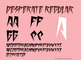
Desperate Acts of Magic? Desperate attempt at poster design is more like it. After having seen the collaterals for The Incredible Burt Wonderstone this poster makes me really really sad. Both Kaufmann and Arial are clearly the poor man's version of Stuyvesant Solid and Compacta.
I would never be able to equal fellow Typophile Florian Hardwig's excellent article about The Great Gatsby on Fonts In Use, so I am not even going to try. Get over there and learn.
The movie poster for Venus and Serena is surprisingly introspective for a documentary about the dynamic duo. The blue and purple hues give the image of the Williams sisters a delicate, poetic atmosphere. All the power is to be found in the commanding wood type display sans. The sans serif paired to the movie title is Neuzeit S Bold, a less common candidate. This is quite a lovely poster; I just don't really like the fake-looking border which seems a pretty gratuitous addition.
This is the first time ever I have seen knitted artwork for a film poster. The German poster for Sightseers is deliciously deceiving. The technique makes it look all lovely, yet when you examine the image closely you start noticing the corpse next to the bloodied caravan, the skull-and-bones frieze with blood dripping, and the real blood stain in the lower right corner. This approach is perfect for the dark comedy it advertises.
We end with a minimalist design by Matt Needle created for the Berlin Film Society, to be given out as a gift at a special advanced screening of the film. It is one of the better minimalist designs I have seen. It doesn't rely on previous knowledge about the movie, but actually does a good job at selling the movie using only silhouettes and a selection of icons. Nice one.


 闽公网安备35010202000240号