


Yearbook of Type Offers Overview of Recent Typographic Production


On the first day of Summer Typodarium, the typographic tear-off calendar – announced the publication of the first edition of Yearbook of Type I. Compiled by the Slanted editorial team in Karlsruhe (Flo Gaertner, Lars Harmsen and Julia Kahl) and some people from the MAGMA Brand Design studio team, the concept behind this publication is to showcase a high-quality selection of recent digital typefaces in a clear, comprehensive English-language compendium. This first edition published by Niggli presents 187 typefaces from both established and lesser-known indie foundries released in the past three to four years.


The general idea behind this compendium stems from the radical changes witnessed in the production and distribution of type during the past quarter century. The accessibility of affordable type design software means anyone anywhere with access to a desktop computer can design and produce their own typefaces. Add to this the internet democratising the means of distribution, and this is the reason why we currently experience an abundance of fonts that are readily available to designers and amateur enthusiasts alike. A variety of online sources provide regular information about new fonts and foundries, but there is no independent print publication – even with the increasing quality of webfonts typography still looks best on paper – offering a broad overview of the field. And this is where the Yearbook of Type steps in, as a book series in which the best new developments in the field of contemporary typography are presented.


I asked Flo Gaertner, Art Director of Slanted Magazine and Partner at MAGMA, what were the criteria for inclusion.
Flo Gaertner | "Of course we were looking for typefaces no older than three to four years, as the Yearbook should collect contemporary type. Other important criteria were quality, innovation and relevance of the releases. We wanted to feature successful typefaces in terms of distribution like Akko or Neue Haas Grotesk, aesthetically interesting or relevant type designs, technically or systematic innovations, large language support etc. We also wanted to include small or upcoming foundries and type designers from outside of Europe that are not so well-known here."
"As there was a small fee to cover production costs we did not get all of the typefaces and foundries that we wanted to include. We were also accepting suggestions by the foundries regarding what typefaces they wanted to present. But about 90 percent of what we wanted to show are included."
Is there a certain focus throughout the book?
Flo Gaertner | "It is about giving an overview of the field, so the selection of typefaces tries to cover all aesthetics, design concepts, categories or styles. We were trying to display the typefaces in the most comprehensive way, and provide as much information about them as possible. The latest in typeface design, easy to select."


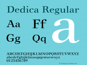
So, how does this book hold up? At 165 × 240 mm (6.5" × 9.5") the hefty hardcover tome with half linen has a nice weight and practical dimensions. The bulk of its 464 pages is dedicated to the typefaces that each occupy a full spread. The printing is crisp and almost all of the typeface showings look great. Each left page shows the typeface in a design created by the type designer or foundry, while the right-hand side holds background information about the typeface or family, credits and technical details in the top half, and a basic character set and concise specimens in the bottom half. This of course is where the limitations of any printed reference book lie. Due to restricted space only a very succinct representation of the typeface can be shown. However the opportunity to see the alphabets printed on quality paper is a huge bonus compared to online showings.
The typefaces are listed alphabetically, yet an index enables the reader to search for specific designs in an index by classification. This index is followed by an alphabetical list of all the featured type designers with short biographies. The selection of typefaces is comprehensive, even though I am sure everyone will find a couple of typefaces are conspicuously missing, which is unavoidable for any curated compendium. Interestingly the book also includes a number of custom fonts which are not commercially available.

Two additional sections round out the book. Essays & Tutorials print articles by Slanted Magazine #19.


 闽公网安备35010202000240号