


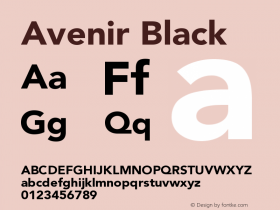
I AMsterdam in Avenir

Photo by Mieke Tacken. See more photos of I amsterdam on Flickr.
As much as I'd like to claim we're the only group to think of it, there is more than one "I Am" campaign. Adidas and Reebok have both used the phrase in recent marketing. (That's everyone's favorite blackletter, Fette Fraktur, in the Reebok ads.)
But my favorite "I am" (other than our own of course) is the city of Amsterdam's decidedly typographic public art installation, "I amsterdam", set in 10 pt.ft. Avenir. The piece coincides with a new motto and website for the Netherlands capital's tourism campaign and it works beautifully. The only quibble might be that a country with such a rich type culture ought to use a Dutch face rather than something born in Switzerland. Yet Frutiger's sans works so well it's hard to complain.


 闽公网安备35010202000240号