


Focus On FontStructors – Paul D. Hunt


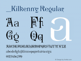
We continue our series of mini-interviews with FontStructors with Paul Hunt. Besides being a FontStructor from the early days, Paul is a "traditional" type designer. Although he hasn't been an active user since some time, he still has the most downloaded FontStruction to his name. Structurosa is an impressive achievement in minimal modular type design, a beautiful showcase of the artistic potential of FontStruct. With its 283 characters this single case alphabet, despite using only a minimum amount of bricks in only two shapes (square and quarter circle), manages to cover a whole slew of non-Latin scripts including Greek, Cyrillic, and Hebrew. It has been downloaded over 6,000 times, and spawned over 20 clones.
Paul Hunt

Born and raised in the rural north of Arizona, early on Paul Hunt became fascinated with the languages and cultures of peoples at home and abroad. He attended Brigham Young University and received a BA degree in International Studies. Paul got involved professionally in design when he took a job as a graphic designer for The Winslow Mail while still living in Arizona. His affinity for languages and design converged within the realm of typeface design, which he initially started as a hobby.
Ever since I was young, I have been fascinated by art, language and culture. I guess it's only natural that these interests have come together in my love and practice of type design.
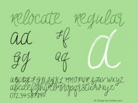
Paul Hunt relocated to Buffalo, NY, to enroll in an apprenticeship at P22, where he started digitising classic typefaces for the Lanston Type Co., then moved on to designing his own personal type projects Kilkenny, P22 Allyson, and P22 Zaner Pro for IHOF – International House of Fonts. With each new project that he faced at P22, he pushed himself to increase his design and technical skills.

The Latin typeface Grandia and its Devanagari counterpart Gandhara which Paul Hunt designed in partial fulfilment of the requirements for the degree of Masters of Arts in Typeface Design from the University of Reading.
Last year Paul pursued an MA degree in Typeface Design from the University of Reading, and added Devanagari to the list of exotic scripts for which he has designed type. After graduation, he worked for a few short months with London's finest at Dalton Maag before he was offered his current position in the type team at Adobe. You can read his typographic and other musings on his Pilcrow type blog.
Paul Hunt registered as a user on April 2, 2008. This was during the last days of the site being in beta mode, before it was announced to the general public. From the get go he was impressed with the technology behind the site and captivated by the wonderful possibilities that this tool makes available to the uninitiated designer of type.
In what way – if any – do you think having FontStruct around when you originally started in type design would have influenced your design method and style?
Had this resource been around when I was first delving into typeface design, it probably would have been one of the first places that I would have started to explore making fonts. I'm not sure that FontStruct would have particularly influenced my actual design method and style as much as it would have probably given me more confidence to just start playing around and trying new things in designing type.

Med Splode by Paul D. Hunt
You are a "true" type designer. How does building FontStructions compare to conventional type design? What are the pros and cons, both artistically and technically?
Thank you for that compliment. Perhaps now that you have called me a type designer I can move on from referring to myself as a "Bézier wrangler". At any rate, there are some interesting contrasts between designing modular type designs and designing more refined typefaces.
With the modular nature of building a FontStruction, it reinforces the idea that there is an underlying structure to a good type design. Even within the limitations of a modular typeface, much care must be taken to harmonize the details of each character so that they blend together as a cohesive design. The advantage of making a font in FontStruct is that typically there are not too many of these kinds of details, and shapes can be reused: you can rotate your 'd' and get a 'p' or flip it to get a b and you will probably only have to rearrange your serifs (if there are any) to make this work. In addition to being the advantage of a modular design, this simplicity is also its flaw.
For something that really reads well, you need more nuance. It is possible to achieve this level of sophistication using FontStruct, but there would be much more work involved than by using traditional type drawing software that allow for outline drawing instead of building up with bricks. Building a functioning text face with FontStruct would be a monumental achievement. I suggest that anyone reading this article not attempt this feat (I'm sure that just sounds like a challenge to some of the more hardcore FontStruct contributors out there). Even if a FontStruct user (or team of users) came up with a flawless set of glyph shapes, more traditional software would be needed to address such concerns as kerning and OpenType featuring.

Structurosa by Paul D. Hunt
Do you feel it helps being a "true" type designer to create FontStructions, or does one on the contrary benefit from approaching the font creation site with a blank slate and an innocent eye?
Sure, I think that having some previous training in typeface design helps a designer to make better decisions on both the micro and macro level. I like to think that it was the refinements I made to Structurosa that made it stand out from the other Fontstructions based on the FontStruct logotype. I believe it is the small details that I added to my interpretation of the popular logo in font form that led to it being the most downloaded font on the site.
On the other hand, I think because I have conditioned myself to see letters in their most simple forms I would never have thought to come up with something so wonderful and striking as Fontstructions like DeTrayne and A Fault in Reality. The great thing about FontStruct is that it makes available a simple, powerful font-making tool to creative designers who might not otherwise delve into producing experimental types.

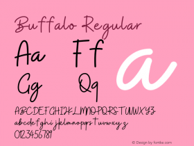
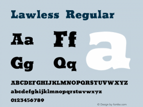
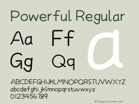
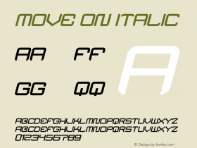
Slabstruct, Slabstruct Stencil, and Slabstruct Too by Paul D. Hunt
Header image:: Typo-toque © Paul Hunt, edited & manipulated by Yves Peters


 闽公网安备35010202000240号