


Communication Arts Typography Annual 4


For the fourth consecutive year Communication Arts – "the premier source of inspiration for graphic designers, art directors, design firms, corporate design departments, advertising agencies, interactive designers, illustrators and photographers—everyone involved in visual communication" – held its annual typography and type design competition. The 2014 Typography Annual showcases the 152 winning projects selected by a distinguished panel of jurors – Sibylle Hagmann, founder and type designer at Kontour Type; Roberto de Vicq de Cumptich, designer, and speaker and author on type and typography; and Erik Marinovich, co-founder of Title Case, a lettering and design studio, with fellow letterer Jessica Hische. With the largest international circulation of any trade journal on visual communications, having work selected for the Communication Arts Typography Annual is considered a significant professional milestone to the creators and publishers of these award-winning projects. Entries were chosen for inclusion on the basis of creative excellence and quality of execution.
With a little under 1,900 submissions the fourth Typography Annual received almost as many entries as last year, yet there was a definite shift in the categories. There were significantly more entries for packaging, environmental graphics and calligraphy/handlettering, while brochures, books and periodicals decreased noticeably. The competition is increasingly international – India, Italy, Japan, Luxembourg, Macau and Serbia were represented for the first time. There still is a prevalence in lettering and calligraphy work, which may seem at odds with the concept of a typography contest.
Juror Sibylle Hagmann:
Overall the entries were very diverse. Lettering and script typefaces prevailed in many typography-dominated designs almost independent of the category. The diversity made for a very lively assortment with great variation of visual styles from retro-nostalgic to contemporary.
Juror Roberto de Vicq de Cumptich adds:
A general wave of interest continues in expressive lettering and hand-drawn type combined with illustration, and also a Victorian approach of mixing several different typefaces in a single piece.
Juror Erik Marinovich offers valuable insight for future contestants:
Viewing a large number of entries like this, it's surprising to see what typefaces and lettering styles are currently popular. In contrast, the entries that showcased an unorthodox approach to those popular typefaces / lettering styles totally stood out.
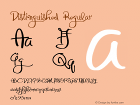
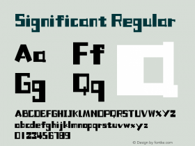
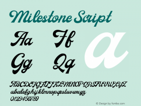
The winning entries are spread over different categories, one of them being type design. The following typefaces were selected to be included in the Annual:

Bangshu Xing
Type designer | Wang Wen
Foundry | Founder Type

Erotica
Type designer | Maximiliano R. Sproviero
Foundry | Lián Types

Minot
Type designer | Jessica Hische

Amplify
Typeface designer | Henrik Kubel
Creative director | Graham Clifford
Foundry | Graham Clifford Design
Client | Amplify/News Corporation

Birds Posture
Type director | Benny Tang
Creative director | MUSE-UM.co
Client | OX Warehouse Macao

Mislab
Typeface designer | Xavier Dupré
Foundry | Typofonderie

Calavera
Typeface designer | Oscar Yanez
Foundry | Cocijotype

Bellissima Script
Type designer | Alejandro Paul
Foundry | Sudtipos

Rolling Pen
Type designer | Alejandro Paul
Foundry | Sudtipos

FF Dora
Typeface designer | Slávka Pauliková
Foundry | FontFont

Dark Angel
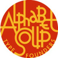
Typeface designer | Michael Doret
Foundry | Alphabet Soup Type Founders


 闽公网安备35010202000240号