


Fun With Vintage 70s and 80s Porn Logos


Last week a peculiar video appeared on the internet. DVNO music video. This homage to 70s and 80s erotic and porn movies uses almost NSFW* film fragments, focusing on the vintage logos and movie titles that appear in the opening credits. While most of the – often hand drawn – designs are genuine, they have been recreated (or designed from scratch) and animated. The trailer-like short is a production by Pornographics Studio, a Spanish multidisciplinary studio in new technologies and multimedia art which operates from Barcelona since 1999. They are a team of eight young people from various fields, countries, and disciplines: art directors, graphic designers, illustrators, motion designers, … Their clients include Diesel, MTV, Seat, Malibu, CCCB, Mango, Pull&Bear, Volkswagen, Tv3, …
| (*) | Although I don't really consider both videos in this post NSFW, our non-European (particularly American and British) readers may not agree. In any case I would advise to view them using headphones. |
Vintage Porn logos from PornoGraphics on Vimeo.
Pornographics Studio explained they have these vintage videos in their files, like a stock bank for viewing, or to include in their designs. They love the graphic language of porn because porn has no taboos. Porno stimulates their imagination, and expresses that all kind of different ideas are allowed. This is the essence of their studio and their design work: everything is permitted. As porno provides them a source of inspiration, the studio felt the need to return the favour and give back to porno. The producers of many of those movies didn't really care about design and typography, so Pornographics Studio decided to redo those graphics and infuse them with artistic quality. All the logos were lifted from genuine movies; from box covers, posters, and so on. Because the original films didn't use to have animated intros, Pornographics Studio redrew the vintage logos and movie titles, adapting the colours and reinserting them in the porn sequences.
Of course, I would be remiss not to take a look at the typographic treatment, so here is a run down of the video. Unfortunately I am not familiar with porn logos, so don't expect me to point out witty references or clever spoofs.

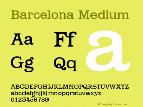
I was quite surprised when I first saw the Pornographics Studio logo. The extra bold constructed modular shapes on their own are not very legible – especially the distinction between the P and the R with their triangular stems seems arbitrary, and the NO combination is unorthodox to say the least. Yet in context it works surprisingly well. I'm less impressed with the horrendous spacing of the "Graphics" set in Helvetica caps at the bottom.

This credit title is the real deal; a groovy, summery display face from the sixties/seventies, filled with a gradient in a ghastly colours. I couldn't find an exact match, but there are similar faces like Cruz Swinger, Klickclack, Catseye, ITC Ziggy, Bottleneck, Candice, and so on.

This sausage type is not only a very appropriate design, but also very hand drawn.

Again a custom designed logo, reminiscent of that other frame from the DVNO music video. Maybe it is based on something we are not aware of after all.

This is another genuine credit title, this time a swirling formal script – Poppl-Residenz.

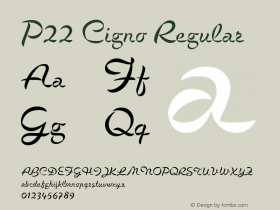
I've always been fond of the naive charm of literal typographic interpretations, like this ribbon type. As far as I know there is no digitised equivalent for this kind of three-dimensional lettering, but La Portenia approximates the feeling quite well, as do P22 Corinthia and the Borges Lettering Type Foundry's designs Alpine Script, Enchanted, and Sarah Script. For a very nice take on ribbon-like type see P22 Cigno.

"Cornetti alla Crema" is Italian and roughly translates as "Cream Croissant". Let's not go there.

It is a bit weird to see a highlight/neon-like effect applied to a sports inspired bold script, a bit similar to Casey, Metroscript, or P22 Brass Script Pro. Note the lovely loopy "Th" ligature that can also be found in ITC Bookman Swash.

This spoof logo is really funny. It appropriates the highly stylised visual language of seventies corporate culture and uses it for an imaginary porn film production company. ITC Avant Garde Gothic perfectly complements the geometric constructed illustration.

This on the other hand is true neon-style display lettering. There are no neon-style scripts (yet) in the Three-Dimensional: Highlight FontList, yet Harlow has a similar shapes and shouldn't be too difficult to customise.

Possibly my least favourite brush script is the eponymous – maybe it's too obvious for my taste? – Brush Script, which stars in this original credit title.

This is a very contradictory typographic image to me. The neon treatment of the extra bold geometric constructed display face looks convincingly 80s, yet the Arial caps above it brutally yank me out of my suspension of disbelief.

At first I thought this genuine opening credit was set in Bordeaux, the popular late 80s David Quay typeface, but it simply is Onyx.

Obviously a custom designed logo, I highly doubt there exists a digital typeface that comes close to those letter forms.

Aha, but I do recognise the reference in this spoof piece. It is of course a humorous take on the Paramount logo, with the folded legs in stockings doing an impression of the mountain. Pornographics is set in Monotype Script Bold, with Futura caps underneath.

All I can say after seeing this lubricious Russ Meyer logo is please somebody digitise a swash version of Cooper Black. Goudy Heavyface Italic is a significant step in the right direction.

Hmmm, this Boogie Nights logo certainly is not the best in the bunch. It sits somewhere between Futura Extra Bold and ITC Bauhaus, but the quality of the character outlines is inconsistent and not up too par with the rest.

Another neon-tinged display script, used in the movie logo for Pink Flamingos, the cult classic by John Waters.

Tango is picture-perfect for that sleazy eighties–early nineties look and feel, especially when it's extruded in gold.

I quite like this spoof on the Warner Bross logo. Adobe Garamond is actually very close to the type in the original.
Thank you Tom Marques for the tip.
Diesel Announces "Dirty 30" Celebration With SFW XXX
Seeing this video and noticing Diesel in the client list reminded me of an outrageous clip I discovered a couple of months ago. To celebrate its 30th anniversary, Diesel threw a "Dirty 30" party in 17 cities around the world. They promoted the parties with the Dirty 30 online viral SFW XXX video, a hilarious spoof on 80s porn movies. The invitation picked up over 20 million views over various channels. In a selection of run-of-the-mill porn sequences crucial areas (I had to resist using "hot spots") were partially overpainted. The animated graphics radically change the seedy scenes, turning them into clownesque, completely over-the-top expressions of silliness. In doing so the conventions of porn are turned upside down, exposing the genre as ridiculous and devoid of any genuine emotion. Priceless.


 闽公网安备35010202000240号