


It's About Papyrus – Again

It is abundantly clear that the cognoscenti of the type and graphic design communities love to hate the Papyrus™ typeface. While not as reviled as the Comic Sans® typeface, Papyrus receives more than its fair share of bad press.
Sure, it's overused, but that doesn't make it a bad design – just popular. And Papyrus does tend to show up in less than stellar graphic design solutions – but, if this is the reason for supposedly sophisticated designers reviling the design, it smacks of elitism.
Would I, use the Papyrus? Probably not – but not because it's a bad design. If I wanted to make a distinctive graphic statement, I would use a typeface with a little less "face time" – one that really would stand out from the crowd.
Which brings me to why I'm writing this. I saw the movie Avatar™ last weekend and was blown away. While the story was little more than a rewriting of "Dances With Wolves," the cinematography, animation and special effects were virtually beyond belief. Like the original Wizard of OZ™, Gone With the Wind™ and Star Wars™ movies, Avatar has set a new benchmark for film making excellence.
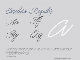
So why are the subtitles for the Na'vi people, the alien protagonists of the film, set in Papyrus? It is the only unimaginative visual aspect of the movie. If the choice were mine, the subtitles would have been original calligraphy. (There are times when custom handlettering is the perfect answer.) One would think that, in the $300,000,000+ budget for Avatar, there would have been some room for hiring a lettering artist or calligrapher. If there was only $30 allotted to the subtitle typeface (which appears to be the case), designs like ITC Noovo™, ITC Tempus™ Sans, Briem™ Script or Carolina™ would have carried off the alien and beautifully exotic demeanor of the Na'vi quite well – and would not have reminded the audience of a restaurant menu.

Allan Haley is Director of Words & Letters at Monotype Imaging. Here he is responsible for strategic planning and creative implementation of just about everything related to typeface designs.


 闽公网安备35010202000240号