


European Design Awards 2010 "Original Typeface" Category Winners


Last Sunday several type designs were honoured at the European Design Awards Ceremony in Rotterdam, The Netherlands. This ceremony is the crowning event of the ED-Festival, a 3-day conference organised around lectures given by speakers and graphic design celebrities from all over Europe. Participants can also join seminars and workshops, design walks and visit local recommended exhibitions. The festival travels every year to a new city in Europe. After Athens, Stockholm, and Zurich, Rotterdam hosted the festival from 28 to 30 May 2010.
All the winners on stage at the European Design Awards Ceremony. Photo by Nils Schoonhoven
The ED Awards is an annual award program acknowledging the best communication design in Europe. ED Awards was created in 2007 and has since been endorsed by the International Council of Graphic Design Associations (ICOGRADA), as well as leading European graphic design magazines. Its main objectives are:
To celebrate European design with all its regional distinctive elements, as well as its common ground.To facilitate European designers to meet, be inspired, and develop networks.To promote, and raise standards for communication design throughout Europe.
The ED Awards 2010 media partners are +design (Greece); 2+3D (Poland); BNO Vormberichten (the Netherlands); DA-Magazin (Austria); Design Week (UK); Elephant (international); étapes (France); Grafik Tasarim (Turkey); idPure (Switzerland); kAk (Russia); Novum (Germany); Progetto Grafico (Italy); Typo (Czech Republic), and Visual (Spain). The jury members are editors from the aforementioned magazines.
In the category Various, sub-category 25. Original Typeface six typefaces were awarded.
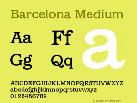
Adelle
Gold Award| designed by Veronika Burian & José Scaglione (TypeTogether)


While Adelle is a slab serif typeface conceived specifically for intensive editorial use, mainly in newspapers and magazines, its personality and flexibility make it a real multiple-purpose typeface. The intermediate weights deliver a very legible and neutral look when used in text sizes, providing the usual robustness expected in a newspaper font. The unobtrusive appearance, excellent texture and slightly dark colour allow it to behave flawlessly in continuous text setting, even in the most demanding editorial applications.
As it becomes larger in print, Adelle shows its personality through a series of measured particularities that make it easy to remember and identify. It has 12 styles, ranging from light to heavy, with more than 800 characters per font. Its energetic character, so inherent to slab serif fonts, becomes evident as the typeface is used for subheadings and headlines.
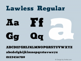
Premiéra
Silver Award| designed by Thomas Gabriel (Typejockeys)

Premiéra is a book typeface specifically designed to work in small sizes. It is available in 3 weights: the "Book" for main text demands and two styles (Bold and Italic) to create different kind of emphasis. A strong x-height and short ascender/descender make this very legible and elegant typeface very suitable for use in books and newspapers. The idea for Premiéra comes from a demand on developing a typeface that works very well in small prints. Its main features – straight lines and sharp forms – developed through a process of testing readability in very small print sizes. The result is a typeface with a strong personality whether you read it in small or in bigger size.
Encore Sans Pro, designed by Panos Vassiliou (Parachute) also won a Silver Award in this category.
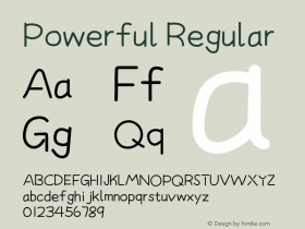
Karmina Sans
Bronze Award| designed by Veronika Burian & José Scaglione (TypeTogether)


Karmina Sans follows the steps of its successful award winning cousin, Karmina Serif. It shares the same technical excellence and it achieves similar stylistic features, but the new sans serif version offers a much more versatile tool for editorial designers.
Karmina Sans has six different weights with their matching italics, from light to heavy, covering the whole spectrum from continuous text to headlines to small text. The heavy weight delivers one of the darkest and most powerful impressions out there while the text weights are perfect companions for Karmina Serif.
Dsignes
Bronze Award| designed by Andreu Balius

Dsignes is a custom typeface designed for specific signal system projects, commissioned by SIGNES (Barcelona).
Archiv, designed by Anton Studer (Atelier Bubentraum) also won a Bronze Award in this category.
Header image:The winners of the "Original Typeface" category on stage at the European Design Awards Ceremony. Photo by Nils Schoonhoven


 闽公网安备35010202000240号