


Working with Alternate Characters

If you want to add style and functionality to your Web typography, look for fonts that have alternate characters. And if working economically, with just one font, the added characters you get with alternates can stretch your design further.
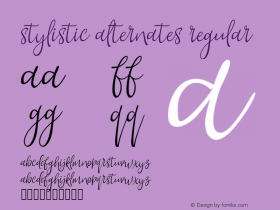
An alternate character—sometimes called an alt character—is a different version of a standard character design. An alternate character may look slightly different than the standard one, and in some cases, noticeably different. For example, some alternate character designs may look more geometric. Others may look handwritten. In one font, there might be a single-story a, and the alternate a could be double-story, or vice versa. There are also functional uses for alternates. You may have a standard Q with a long tail, but it gets in the way when setting a title, so you could use an alternate Q with a shorter tail.
It just takes a little CSS know-how to take advantage of the extra character designs. If a font has alternate characters and browsers support it, you can enable them with the stylistic alternate value ("salt") in the font-feature-settings CSS property.

The Muller typeface, which has a total of 20 styles including the hairline shown here, has a standard a that's two-story (top), but you can enable the more geometric single-story a (bottom) using CSS.

The Aviano Contrast typeface has alternate characters, seen in the bottom, that have different crossbars and tails. And notice how the alternate B shown in the bottom row has an unconventionally large upper bowl.
Alternate Characters, Alternate Styles
Alternate characters come in handy for stylistic uses, such as the longer tail of the Warnock® Pro typeface's alternate Q. Its elongated quality makes for a more elegant appearance, especially when it comes to setting headings that you want to get noticed.
The Warnock® Pro typeface designed by Robert Slimbach, has an alternate Q, y, w, and v featured in the lower, smaller version of Quietly woven.
If a font has alternate characters, you can enable them with CSS using the salt value:
font-feature-settings: "salt";
-webkit-font-feature-settings: "salt";
-o-font-feature-settings: "salt";
-moz-font-feature-settings: "salt";
-ms-font-feature-settings: "salt";
If a font has a second alternate character, you would use "salt" 2. If a third, you would use "salt" 3, and so forth.

Not only does Mark Simonson's Mostra Nuova typeface have 30 styles in one font, but it also has a variety of stylistic alternates. Standard characters appear in the topmost example, with first ("salt"), second ("salt" 2), and third ("salt" 3) stylistic alternates appearing beneath.

The sans serif Bree™ typeface by Veronika Burian and José Scaglione has a handwritten quality seen in standard characters such as the Q, e, g, k, v, w, y, and z. But alternate characters, seen in the bottom example, give a different look and feel that's more conservative.

The Bree Serif typeface is similar to its sans serif relative, only with chunky slab serifs. It has alternate characters too (bottom example) such as the two-story a and g. Notice the difference between the two e characters.
Alternate Characters in Use
Functionally, alternate characters can help differentiate a heading from the running text, especially if you use the same font for both, and want to create added contrast between the two.

In the example above, alternate characters have been enabled with Bree's heading, but the running text set in Bree Light uses the standard characters for more of that handwritten touch.

Here, with Bree Serif, we have the alternates in the heading as well, and the running text, set in the same weight, with the standard characters. But sometimes, the alternate characters can get in the way of things. In the example below, the alternate Q has a tail that comes too close to the heading continued on the next line.

This is a good case for a Q with a shorter tail found in the standard design, instead of the alternate character and its longer tail. So we remove the font-feature-settings: "salt" property from the heading, to use the standard Q, shown below. For good measure, the leading—called line-height in CSS—has been increased for added air in between the heading's lines.

Harness the Power of Alternate Characters Early
When going through the process of choosing a typeface, look at how it functions for your Web typography by creating permutations of headings, running text, captions, and pull quotes. Test for readability and legibility. And use alternate characters for fun and flair, and function too.


 闽公网安备35010202000240号