London Underground's iconic Johnston Sans typeface
There are many icons of London – Buckingham Palace, the Houses of Parliament, the London Eye – but equal to these is the Johnston typeface. The font permeats the city's transport networks – and is also a core part of the branding of the Mayor of London, so is used on projects that sell the city to the rest of the world. It synonymous with London to those who live here and those who've never visited.
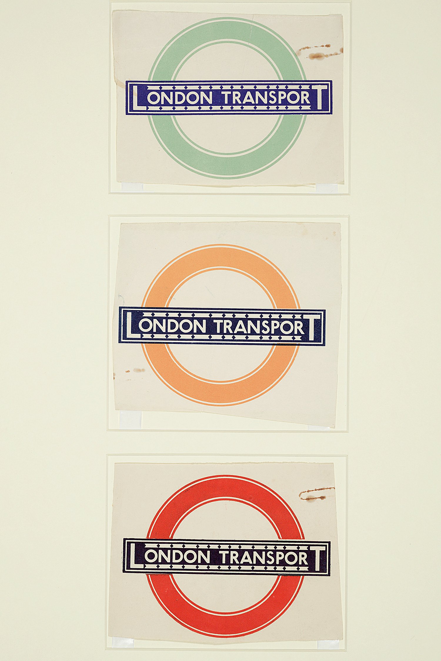
While it's been tweaked many times and digitised since it was originally drawn by Edward Johnson for use on the Underground, its design has remained true to the clear, clean lettershapes of its initial forms.

The typeface was commissioned to be distinctly different from the lettering used in advertisments of the era – to help passengers navigate around the network more easily. It still serves that purpose, though the scope of its use has grown to include buses, trams, boats, the Dangleway, cyclepaths and general wayfinding during the 2012 Olympics.

Johnston's font was originally just called Underground. It was later renamed as Johnston's Railway Type, and then Johnston. It was redesigned in 1979 by Eiichi Kono to add more weights – so it could be used for a greater number of purposes, for example in smaller point sizes.

In the early 1990s, it was digitised – then redigitised by Monotype in 2002, when italics were added. In 2008, further minor changes were made to bring it back to be more in line with Johnston's original designs. Johnston's version of the typeface included two weights, Heavy and Ordinary. The former is an all-caps font.








 闽公网安备35010202000240号