


Why Apple Abandoned the World's Most Beloved Typeface?

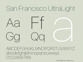
After two rocky years as Apple’s typographical identity, Helvetica Neue is being replaced by a bespoke font, San Francisco, as the default font on both OS X El Capitan and iOS 9 this fall.

San Francisco is the first in-house typeface Cupertino has designed in more than 20 years. With its clean, compact shapes, subtle roundness, and ample space between letters, San Francisco was no doubt designed for maximum legibility on the Apple Watch. But at WWDC yesterday, amid the hoopla around new operating systems and streaming music, Apple snuck in another development: San Francisco was always meant for more than the Watch’s tiny screen. It was designed for your phone and desktop, too.

For a company whose fortune stems in no small part from its commitment to design, you’d think Apple would be quick to extol its typographical handiwork, but it was low key about it all. Why?
It could be that Apple wants to save face.

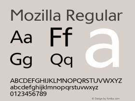
“Apple is really, really behind when it comes to typography,” says famed German typographer Erik Spiekermann. Google introduced its custom font, Roboto, in 2011, and Spiekermann developed Fira Sans for Mozilla a few years back.

That’s a bit harsh. After all, Apple has been so dominant in other areas that anything less than stellar typography is going to draw critics. San Francisco isn’t perfect, says Tal Leming, a typographer and programmer at Type Supply. He has quibbles, for instance, with some of San Francisco’s numbers—the top of the “6,” for instance, loops so far down that it can be mistaken for an “8.” But, he says, such things can be overlooked. The company has moved the needle so far in so many areas, that it simply doesn’t matter. “When it comes to design in general,” Leming says, “Apple is in their own universe.”

The differences between Helvetica and San Francisco are subtle, even to the trained eye, but they’re there. While still an austere sans serif, San Francisco is bolder and friendlier than Helvetica Neue. Based on the German typeface DIN, San Francisco gives characters more breathing room, which will make it easier to read on relatively tiny mobile screens. Tall and skinny, San Francisco is space-efficient, like Google’s custom typeface Roboto, which you could consider a close cousin to Apple’s font.

San Francisco may not be a daring choice for a design-led company, but when creating a font for small screens, variation takes a backseat to clarity. After all, typography isn’t just an element of user interface; on some type-heavy mobile apps, it is the user interface. As the renowned typographer Tobias Frere-Jones explains, type pervades so many user interactions, from the mundane choices like OK/Cancel, to sensitive content like personal data.

That’s why switching fonts shouldn’t be taken lightly. “Seeing it change is jarring and disorienting, like coming home to find that the walls in your house are now a different color,” he says. “So it’s unfortunate that Apple will be changing their interface typography again, so soon after introducing Helvetica.” But, he says, Apple is right not to settle: “I will commend Apple when Helvetica is fully replaced, because that design is really not up to this job.”


 闽公网安备35010202000240号