


Celebrating 20 Years of FontShop With Jürgen Siebert


Now Chief Marketing Officer of FontShop AG, Jürgen Siebert joined FontShop in its very early days. The dynamic co-founder of German graphic arts magazine PAGE was involved in every major marketing project of the original vendor of digital type. Jürgen also co-edited FontBook – dubbed the bible of digital typefaces – and is a member of the FontFont TypeBoard. Since 1997 he has been responsible for FontShop Germany's TYPO Berlin, arguably the largest annual design conference in Europe. Jürgen edits Fontblog.de, an online journal of design, typography and media which entered the Top 20 in the German blog charts in summer 2008. Translations of his posts occasionally find their way to the FontFeed.
What background do you come from?
Actually I'm a physicist (tertiary education), but I always loved to write. I received better grades at high-school in literature than in natural science. So I started a career as a scientific journalist after college, writing e. g. for Frankfurter Allgemeine Zeitung and science magazines. In 1986 I was hired by a magazine publisher in Hamburg Germany to join the Macintosh magazine MACup. At the time I started the job Apple had been struggling economically. As a consequence, the publisher created a second magazine that had to be independent of any computer platform. He decided to focus on "desktop publishing". We named it PAGE. I became editor-in-chief and dove into the world of Gutenberg.

The PAGE editors in 1987, in the early days of Desktop Publishing. From left to right: Jürgen Siebert (editor in chief), Martin Peinemann (editor & proofreader), Peter Drawert (publisher).
© PAGE, Hamburg
Were you already involved in some way in (digital) typography?

Not before PAGE – except that I loved writing, drawing, and lettering when working on projects in school. During my 5 years with PAGE typography became my real passion and I always allocated a lot of pages to the topic in every issue. I did interviews with famous type designers, like Just + Erik, Georg Salden, Sumner Stone, David Berlow, Neville Brody. I commissioned Erik Spiekermann to do a monthly column (called "Typothek"), visited companies like Linotype, Monotype, URW, and Berthold, travelled to international conferences like ATypI, and learned a hell of a lot about typography, type design, and type technology.
When did you join FontShop, and how did that happen?
It was a phone call from Erik Spiekermann in the beginning of 1991. He said they wanted to expand the FontShop network into different countries and founded FontShop International for that reason. He was looking for somebody who could combine both strategic and marketing skills. He was very familiar with my work for PAGE so he thought I would be the right person for the job.
That was a big challenge for me. At that time PAGE was doing well. Within 4 years, I helped the magazine grow from a quarterly, to a bi-monthly, and finally to a monthly. Advertising and the editorial team were in good shape, with a talented co-editor who was able to take over my job. So in April 1991 I moved to Berlin to join FSI.
For more than a year I coached the PAGE team once a month as co-publisher to ensure a stable transition. I started a monthly column that I still write – after nearly 20 years.

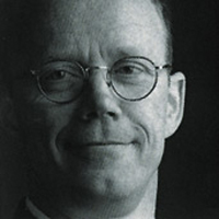
Jürgen Siebert in the early days of FontShop.
What did you do at FSI?
The first thing I was involved in was founding FontShop Italy in Milan, a cooperation with FUSE project: a quarterly, digital publication that brought me back to my old skills. FUSE was very successful. We had about 500 subscribers worldwide. Every FUSE issue contained 4 posters, 4 experimental digital typefaces (on a 3.5″ diskette), and an editorial booklet). We published 17 issues in the following years.
Parallel to FUSE I was also responsible for the development of FSI's exclusive type library, FontFont. The first FontFont release (Five Dutch Designers) was just published when I joined the company. My task was to prepare the second release that contained FF Meta, FF Dolores and FF Typeface Six. It was an amazing expansion. The library grew very, very fast because we took advantage of a completely digitized infrastructure, technology that was new at that time. Other foundries still received paper drawings that they digitized in their own studios. FSI just cut that part out of the workflow and only accepted digitized typefaces. Within three years we had over 1,000 FontFonts in the market – all new designs.

Jürgen Siebert and his 1 year old daughter Marie, photographed by Gerhard Kassner at TYPO 96.
Why did you leave FSI to join FS Germany?
After 3 to 4 years the international expansion halted – either because the franchise model did not work anymore and/or because there wasn't the commitment required to grow. So I felt more and more eager to realize my marketing ideas in a proper, unfiltered way within a local FontShop. Joan Spiekermann, who was head of FontShop Germany, gave me the freedom to do this. I built a totally new marketing team. We brought everything in-house and developed all our ideas internally. Only the design of our marketing material was produced by outside studios like MetaDesign, moniteurs, stereobloc, Factor Design, and many others.
What was your biggest challenge in your marketing career at FontShop Berlin?
It was definitely the start of Fontblog. At first I really didn't know what I was doing. But after a while I noticed that there was no better marketing tool for my style of communication. I enjoyed every comment, and within a few months FontShop Berlin evolved from expert-driven communication to customer-driven communication. I have taken a lot of ideas and strategy from Fontblog feedback. That makes our service better – the product selection, the support, and especially our TYPO design conference.

Entrance hall at FUSE 95. © Gerhard Kassner

Left: Jürgen Siebert at the FUSE 95 press conference. Right: Neville Brody photographed by Gerhard Kassner.

Jürgen Siebert at the FUSE 95 press conference. Sitting down, from left to right: David Carson, Prof. Roland Henß (responsible for FUSElab and the Student FUSE project), Erik Spiekermann, Neville Brody. © Gerhard Kassner
Last year TYPO Berlin celebrated its 15th anniversary. Where did it all begin?
The idea of a yearly design conference in Berlin originated in 1995. Neville Brody – co-founder of FontWorks (then the British FontShop franchise) and mentor of the FontFont library – wanted to organise the second edition of his FUSE conference in Berlin, one year after the original FUSE 94 in London. FontShop did the local marketing, booked the conference building, and organised the ticket sales. The wonderful line-up of speakers assembled by Neville made FUSE 95 in November 1995 a well-attended and very successful conference. We subsequently received numerous requests from visitors for a yearly follow-up of such an event. Because FUSE was defined as a travelling conference, we decided to spin off our own local FontShop conference. We called it TYPO Berlin, which premiered in October 1996 with TYPO Berlin 96 – Idea vs. Ideology.
Some months prior to the first TYPO Berlin conference we hired Bernd (Benno) Rudolf. He quit his job as a conference manager at the Haus am Köllnischen Park, home of FUSE 95. Together with Benno we developed TYPO Berlin to what it is today: Europe's most successful design event, with 1150 visitors and 250 guests (speakers, press, etc.) at the most recent edition.

TYPO 96, the first TYPO Berlin conference at the Haus der Kulturen der Welt © Gerhard Kassner

Jürgen Siebert preparing for the press conference of TYPO 96 © Gerhard Kassner

Presentation by, and discussion with David Berlow and Neville Brody on the TYPOstage in 1996
© Gerhard Kassner
Next year's theme is Shift. What is the concept behind it?
We've chosen the theme Shift because this is exactly what happens in the communication and design industry at the moment – there is a major shift going on. However – although developments are dramatic and technology is speeding up – we are neither in the middle of a revolution, nor do we experience any major turning point. But things are definitely shifting – the emphasis, direction, or focus are changing. Look at the latest developments in Webfonts, social networks, mobility, publishing, … neither of these fields are experiencing radical steps, rather gradual transformations. One would better not underestimate the power of shifts: they come quiet, yet are powerful.
The typographical interpretation of Shift also plays a role in the concept of next year's conference. We're all using the Shift-Key on our keyboards hundreds of times a day, to enter a world of characters beyond the lower case letters. This additional meaning of the theme relates to the core competence of TYPO Berlin, which was, is, and will always be type and typography.

Jürgen Siebert (left) and Bernd (Benno) Rudolf (right) overseeing proceedings backstage at TYPO 2008 (Jonathan Barnbrook in the background). © Gerhard Kassner
One of your most recent marketing efforts is FontShuffle for the iPhone and iPod Touch. It looks like you are focusing increasingly on type and reading on screen. What do you think is the future of digital type?
It is hard to predict anything. A couple of months ago I actually had the impression that typefaces and typography were doomed to fade away. From a typographic point of view, the World Wide Web has been a desert for almost a decade. Designers and everyday users are used to read their everyday information in boring default typefaces like Arial, Times, Verdana, Georgia and so on. For the last almost ten years it seemed as if nobody missed decent typography. When the first webfonts came out their reception by the general public was worse than modest. One could have expected a sigh of relief and a rush towards quality type that was finally available for onscreen reading. Yet we had absolutely no sales at all in the first days following their release. My theory was that there was a whole new generation of readers on the internet who barely knew anything about books, magazines, and other printed media. As they grew up in a typographically underdeveloped digital world they came to see this typographic wasteland of half a dozen default fonts as the norm.
Fortunately the most recent developments in the field of online typography have proved me wrong. With the help of a number of major players like Typekit, Google, Monotype and Font Bureau we can finally readjust (or should I say shift?) our ideas of what typography can look like on the internet. Major companies have started redesigning the typography on their websites. Because of their high profile their efforts are important signals for the whole industry chain, from type designers and foundries over designers and web designers to clients and end users. Thinks started to change in earnest some months ago and things are starting to become interesting again, for which I am very happy.
Last but not least Apple caused a major breakthrough with the Retina display on its iPhone 4. Never before have I seen such amazing type quality on a back-lit medium – except when I was examining offset film on a light table. This new 330 dpi screen resolution is the major argument for raising the bar when it comes to the typographic quality of web pages, operating systems, PDF documents, and other online written media. This latest advancement dissipated the last of my worries, and now I have regained my belief in the diversity of type on screen. Even better, it will accelerate the assimilation of fine typography on screen-based devices because high resolution monitors like the Retina display have no need for hand tuned screen fonts like conventional monitors do. Web designers will be able to use the same high quality typefaces that "analogue" designers have used for print since centuries.

Jürgen Siebert 2010 @ FontShop Berlin. Photo by Thorsten Wulff.
Header image:Jürgen Siebert pulling the strings behind the scenes at TYPO 2003.
© Gerhard Kassner.


 闽公网安备35010202000240号