


Reviving Caslon

Part 2: Readability, affability, authority
[read part one]
When their words are put into print, writers want the text to be inviting and welcoming, so that readers will read what they have written. And they also want the text to have an aura of credibility, so it will be taken seriously and maybe even accepted.
When I read Einstein's Autobiography many years ago, as both a writer and a lover of type I noticed and remembered that the font it was printed in seemed extraordinarily approachable and easy to read—even while projecting strength and authority. James Mosley reports that printers used to say, "You can't tell a lie in Caslon." And then he adds wryly: or is it that you won't get caught? When I started my revival of Caslon, I set out to revive these qualities I had seen in its letter press Linotype Caslon Old Face: readability, affability, and authority.
I. READABILITY
What does it mean for a text to be "readable"? In English some have made a distinction between legibility and readability:
"Legibility" is based on the ease with which one letter can be told from the other. "Readability" is the ease with which the eye can absorb the message and move along the line."
—Types of Typefaces (1967) p. 84-5.
The same distinction is discussed by Walter Tracy:
[Readability] describes the quality of visual comfort—an important requirement in the comprehension of long stretches of text, but, paradoxically, not so important in such things as telephone directories or air-line timetables, where the reader … is searching for a single item of information [and where legibility is most important].
—Letters of Credit (1986), p. 31.
My main goal in my revival was maximizing this quality of "visual comfort."
What qualities of a typeface make for visual comfort? Here there is no consensus but raging debate, including even over whether the concept is valid. I will not go into the debate here, but just relate my own ideas on reading comfort that I have in effect tested in creating my revival. (For the debate see the survey paper by reading psychologist Kevin Larson, and this Typophile thread.)
A. THEORY
We can see in the following graphic that legibility of individual letters is indeed different from the readability of whole words:
All of the letters in "legible letters," above can make easily readable words when they are used to form words with their mates in the same style and weight. However, when letters with different weights and styles are mixed, the words can only be read slowly, with difficulty. What this shows is that the design of individual letters is not enough to make for readability. Some kind of harmony among the letters is needed for our brain to be able to capture and process either individual letter parts, or whole letters, or both, so that we can quickly identify words.
This illustration suggests that the brain is putting some kind of grid or matrix over the word, and that it identifies letters and words by how the black and white fall within that matrix. This idea also accounts for two of the qualities that are prized in text type: regular rhythm and even color.
Here, readability noticeably deteriorates with irregular spacing. Readability also suffers when rhythm is disrupted by irregular widths of characters:
Indeed, with a "Fourier transform," which mathematically shows the regularity of variations of black, text fonts show a fairly, but not completely regular pattern:
Here the white bands show the frequency of the black running across the page, with the distance between the whites I believe being about the width of the n. (Thanks to Peter Enneson for the graphic.)
Both the evident regularity and the deviations from total regularity are, I think, characteristic of good type. The regularity enables the brain to lay the grid over the type, and the deviations from total regularity are what we "read" as the message. Uneven color (density of black) also harms readability:
A plausible explanation of the need for even color is that too much variation in light or dark constitutes "noise" that interferes with the "signal" to the brain from the different parts of the word.
In addition to even color and rhythm, there are two more factors that seem to be critical to ease and comfort in reading. One of these is the overall blackness of the type. In fact, bold type is almost never used in extended text; it seems fatiguing to the eye. And if the type is too light, the contrast with the paper is too little, and the text is hard to read.
The roughly ideal stem width was already traditionally specified by scribes, with the x-height being between four and a half and five widths of the nib of the pen.
Nib widths — source.
The great type designer Adrian Frutiger has written:
It is a quite specific ratio of black to which gives the x-height band of a typeset line a grey value which the reader finds to be "normal". These proportions are perceived with astonishing sensitivity … An average value … is a theoretical band of 5 stroke thicknesses. The grey value is composed of 2/7 surface coverage and 5/7 white space, corresponding to a density of rather less than 30 per cent.
In testing James Montalbano's Clearview Highway typeface for road signs, researchers found that with the stroke ratio near the traditional 1:5, viewers could read the signs sooner and farther away than with bolder weights. While signs and extended text are not the same, the corroboration of this ratio is striking. The advantage of the total white being roughly twice the black, as Frutiger pointed out, may relate to the eye needing a clear figure-ground distinction. It may also relate to the advantage of having the counters (white space within letters) big enough—a factor that showed up in other tests of Clearview Highway.
A final factor in readability relates to a special problem of latin type, which is its vulnerability to the "picket fence" or "zebra" effect, which causes that type to "dazzle." If you look at a line of black pickets against white, they dazzle:
Similarly, because of the need for regular rhythm, this dazzle is always threatening to happen to roman type, the most common complaint being about the "dazzle" of Bodoni:
So a typeface designed for reading comfort will also try to avoid this 'picket fence' and the associated dazzle.
B. PRACTICE
Given the constraints of even rhythm and color, and a narrow range for the weight of stems and the ratio of black to white, how different can one good text font be from another? Erik Spiekermann has said that there can only be a 5% difference, and that may be true.
Because I had found the letterpress 12 pt Linotype Caslon Old Face particularly comfortable and inviting, I took as my working hypothesis that there is some ideal in proportions, the weighting and modulation of strokes, and spacing, and that Caslon's Pica 2—and the Lino revival of it—had somehow hit nearer the mark in some ways than other faces. Further, my feeling was that even though it might not make a huge difference to reading speed and comprehension, hitting the ideal would communicate itself visually to the reader as a feeling of ease and welcome—and then would of course be in fact an effortless read.
So I set out by trial and error, with variations, to see what would work. And I triangulated between scans of the original and close copies—letterpress Lino Caslon and Founders Caslon—on one hand—and Adobe Caslon on the other. Adobe Caslon is a very well drawn face by a superb designer, Carol Twombly, but for me didn't have the magic of the metal versions. Why? What was missing?
When we compare Adobe Caslon, the original, and Baskerville, we can see that it is kind of a "Caskerville", looking like it's morphing from Caslon to Baskerville.
As I have said, deciding what is "essential" in Caslon is somewhat of a Rorschach test. I tested a lot of variations, and two things I noticed first: Adobe Caslon "n" is wider, and the top arch is thinner and differently shaped than the original.
Both of these turn out to be important to the "dark but open" look that I think is attractive in Caslon.
The width of a typeface is one of the basic features of the "DNA" that give it its look, its texture on the page. Other basic features affecting rhythm are the spacing between letters, and the thickness of the stems. Together, these give a characteristic rhythm to the text. I gave my characters about the same stem width as letterpress printed Lino Caslon Old Face, and Adobe Caslon, as this suits modern printing. However, I made them slightly narrower than Adobe Caslon, matching the original Caslon Pica 2, and spaced them a little looser—a little more "air" between letters. The result it that they take about the same space, but Williams Caslon text (above) has more of an open feel than Adobe Caslon (below) at equal x-heights:
In order to get the effect of print at small sizes in looking at these on screen, move slowly back 6 feet or so away from the screen. That's the only way to emulate print, because if you make text small on the screen, you get artefacts from low resolution (96 dpi screen vs 2500 dpi print), and it doesn't look like 8-12 point print. And if you make text large on the screen, and look at normal screen distance, you don't get the optical effects that happen at small sizes. The critical variable according to psychologists is the visual angle spanned. With larger type on the screen, walk slowly backing away from the screen, and you get a pretty good emulation of print. Try it, you'll see!
Two special visual effects operate at text sizes. The first, and most well known, is that the spaces between letters appear tighter. In order to have a readable rhythm, the text sizes need more letter space than at larger, display sizes. In my view, many types today, including Adobe Caslon, and especially Times New Roman, are a little too tight. Just a little more "air" between the letters makes for a more comfortable read, to my eyes; so I have given Williams Caslon Text a hair looser spacing than most types today. The spacing is not a separate matter from design, though, as the width and design of the characters need to be "tuned" to the spacing to get the overall effect.
A second effect is that as the characters shrink in size, the "thins" get thinner visually faster than the "thicks" get thinner. This is why traditionally at very small sizes, 8 points and below, contrast between thick and thin is reduced for the sake of readability. And in letter press printing, an additional reduction in contrast was caused automatically by ink spread, as I explained in Part 1 of this essay. That is why the initial practice of basing digital versions of old typefaces on the 14 pt outlines, as I have heard, resulted in anaemic looking and less readable text type.
The adjustment for text size is, however, not simply a matter of increasing the thins by a fixed amount. It turns out that the eye responds differently to changes in horizontals, verticals, diagonals, and joins. So thickening is a matter of sensitive modelling of the arches so that the whole character appears 'dark', but does not become 'clunky' at the intended size—a fault of some contemporary "dutch" style types, to my eyes.
So here is a comparison of the modelling I did on Williams Caslon Text with the original, Lino Caslon Old Face, and Adobe Caslon:
The Williams Caslon Text regularizes the original, rejecting the leftward lean of the stem, and smoothing the arch. But it follows the way the weight is modulated through the shoulder. At the same time, the stems are as light as Adobe Caslon, and even lighter in the baseline-to-x-height region, as they have a "waist" in that region, following the original. Williams Caslon Text in red, Adobe Caslon in black.
The result is, as we can see in the previous graphic (viewed from a distance), and more so in extended printed text, that Williams Caslon Text looks both darker and more open at the same time.
The "waisting" also helps break the picket fence, so that the letters do not assault with dazzle, but rest invitingly on the page. Here are Williams Caslon (above) and Adobe Caslon (below) with a challenging word (move away from the screen again!):
And Adobe Caslon is already better than many fonts in avoiding the "picket fence", because of its old style serifs.
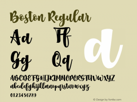
There are other features designed for both even color and to have a "dance" of varying shapes across the page, particularly at x-height. Here is the result, as seen in Boston Magazine:
II. Affability and Authority
The same features that promote readability contribute to the affability of Caslon: its welcoming and unpretentious look. The most important part of that is probably just the ease with which it can be read. In addition, Caslon has a hand-molded look which has a human touch that conveys more warmth than sharp geometry. Caslon's sturdy serifs also give a message of reassuring solidity. The rounding of the serifs that comes from ink spread is also a softer, more relaxed and comfortable feeling than faces with sharp serifs. However, filled-in joins simply look clotted and ugly, so here I have not followed the ink-spread look. Clotted joins would look antiquarian or nostalgic, while the sharp joins look clean and contemporary.
The "dark but open" look affects not only words, but the text block. Because of the open look, Williams Caslon Text can be set with relatively less leading, and still be readable. Many contemporary darker types, such as Quadraat, call for more space between the lines to invite the eye, resulting in more of a "black and white stripes" look. In contrast, and going against current trends, Williams Caslon can be set tighter vertically, resulting in more of an even "lattice work" look, which somehow makes the whole page look more open. In order to enhance this, I have also provided as an alternative "stylistic set," accessible through Open Type, a version with shorter descenders, matching the short descenders of Lino Caslon Old Face. This enables the type to be set with about 1/2 point less leading.
The feeling of authority of the metal Caslons comes, I believe, primarily from its assertive caps. Caps are an essentially different alphabet, encompassing more white space than their lower case companions. Since they serve as "markers" of a sentence beginning, or a proper name, the difference in look offers an opportunity that can be taken advantage of, rather than minimized. While caps that more match the color of the lower case are a valid choice, the traditional more dominant caps can work aesthetically, and in this case add considerable strength to the look of the face.
In Adobe Caslon, the caps were made assertive by making them tall—taller than they are in the original, while they are lighter, and more tapered inward. My approach was rather to keep them the original height and make them straight sided—which I think looks stronger—and the serifs more beefy, as with the lower case. Williams Caslon Text thus has waisted stems on the lower case and straight ones on the upper, whereas Adobe Caslon is the other way around.
Finally I should say that a key to both the aesthetics and the readability of the font has been looking at the letters printed out at size. Caslon has always been a "workhorse" rather than a "showhorse." Its sturdy serifs were a choice to put readability and reassuring strength over the elegance of a Garamond. On the screen, large, Williams Caslon Text looks too clunky, whereas printed at text size, to my eyes it hits the right weight and contrast for comfortable reading, and is aesthetically appealing.
III. THE ITALIC
The original italics of Caslon Pica 2 are to my eyes just not that good, and would probably have never been revived except for the qualities of the roman.
And in fact, in the 19th century, this seems to have been completely recut, and the 20th century revivals based on the recuttings. To my eyes the biggest problem is that it is too narrow for decent readability. Even though companion italics don't have to be so readable as the roman, the original starts to be a barrier to anything more than a few words. Evidently, Carol Twombly felt the same way, as she widened the italic considerably. As I wanted it to be able to set several lines, e.g. of poetry as well, I also widened it, and made it a bit more upright as well.
Making it more upright turned out to be more complicated than I thought, because I wanted to preserve the variation in angle of the stems, which is an old style feature that was abandoned in the 19th century recuttings, and also in Adobe Caslon. But I did discover a systematic visual logic in the variations, and I reproduced that in a more upright version.
Finally, there was the question of swashes. The original Caslon had only swash caps for JQTY. Various additional ones were added in the nineteenth century. Now, the tendency is to add swashes for all the alphabet, though some work better than others. Swash caps are an interesting hybrid, because they are a cross between slanted rigid roman caps, and script. That tension or contradiction between rigidity and exuberance gives them a happy, show-off quality.
IV. THE CHARACTER SET
Williams Caslon Text is one of the first of the new "Premium Open Type" fonts from Font Bureau, with small caps, both roman and italic, Central European characters, and many other different features, such as six different styles of numbers. And everything is kerned to its mates. For example, swash caps are kerned to italic small caps, an attractive and unusual combination. While most of the thought went into how the lower case roman should look, most of the work went into the 3,000 characters and 16,000 kerning pairs. In addition to readability, affability and authority, the font needed a comprehensive character set, and functionality to match, to work effortlessly and enjoyably for designers and readers.


 闽公网安备35010202000240号