


U&lc Volume Nine-ITC Finds New Elegance

 Herb Lubalin's name is missing from the masthead of U&lc Volume Nine. He art directed all the previous issues up through the first in Volume Eight and lent a hand with the second – but passed away while it was being printed. Lubalin was a brilliant, iconoclastic advertising art director. Typography was always at the center of his work. It is where you start with Lubalin and what you eventually come back to. "Typography," however, is not a word Lubalin thought should be applied to his work.
"What I do is not really typography," he said. "I think of typography as an essentially mechanical means of putting characters down on a page. I design with letters. Aaron Burns calls it, 'typographics,' and since you've got to put a name on things to make them memorable, 'typographics' is as good a name as any for what I do."

Lubalin was followed by a series of luminary "guest" designers who built on his powerful foundation, adding their own chapters to the story of U&lc. B. Martin (Marty, to friends) Pedersen was the first. His design brought newfound grace and elegance to the pages of U&lc. Pedersen also used color for the first time in the publication. It's pretty amazing, when you think about it, that a publication about type, typography, calligraphy, photography and illustration could get by for eight years just printed in black and white. The cost of color printing was the obstacle, but as more and more articles cried out for color, aesthetics (and the persistence of Pedersen) won out in Volume Nine Number One.
 Pedersen's feature article "The Dream of Flying," in Volume Nine Number One, is a design and typographic tour de force. If you look at no other article in the four issues of Volume Nine, spend some time with this one.
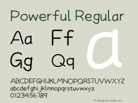
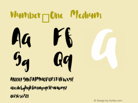
Four typeface families were also announced in the pages of Volume Nine: the ITC Cushing™, ITC Modern No. 216™, ITC New Baskerville® and ITC Caslon No. 224™ designs. ITC Cushing and ITC Modern No. 216™ are revivals of early twentieth century typefaces, the former from American Type Founders and the latter from the British foundry, Stephenson Blake. ITC New Baskerville was originally a Linotype® typeface but was licensed to ITC on an exclusive basis, and ITC Caslon No. 224 was designed as a text companion to the very successful ITC LSC Caslon No. 223™ display design.
Click the PDFs below to find out what else was in U&lc Volume Nine.
Low Resolution:
Volume 9-1 (Low Res).pdf (13.9 MB)
Volume 9-2 (Low Res).pdf (15.3 MB)
Volume 9-3 (Low Res).pdf (14.8 MB)
Volume 9-4 (Low Res).pdf (15.9 MB)
High Resolution:
Volume 9-1.pdf (72.9 MB)
Volume 9-2.pdf (74.0 MB)
Volume 9-3.pdf (72.7 MB)
Volume 9-4.pdf (73.3 MB)

Allan Haley is Director of Words & Letters at Monotype Imaging. Here he is responsible for strategic planning and creative implementation of just about everything related to typeface designs.


 闽公网安备35010202000240号