


Fonts and the Digital Reading Experience

Monotype Imaging is pleased to have two of its type specialists speaking at the Reading Digital Symposium on April 27-28, 2012 at the Rochester Institute of Technology.
Web fonts and e-publishing tools bring a vast array of typographic choices. But how do you effectively harness type and typographic controls that were once the domain of book designers and print publishers?
Meet experts who will help you make the right choices. Monotype Imaging's Steve Matteson and Tom Rickner go "under the hood" with type for the screen:
Steve's presentation, titled "Type, Tech, and Tools to Change the Way We Read" will cover business, technology and design issues that impact typography in the new and exciting medium of e-books. As creative type director for Monotype Imaging, Steve is a designer of typefaces for brands such as the Microsoft Xbox video game console and the Google Android operating system, for which Steve designed the Droid fonts. Steve will discuss why type is important, what goes into the type design process and what the challenges can be when creating typefaces for electronic media.
Tom's presentation, titled "Hints about Hinting – the Achille's Heel of Type on Screen" will equip the attendee with an overview of the concerns impacting the functionality and the perceived aesthetic quality of the final font product used in delivering e-book content. Tom is a technology expert for type on screen and has hinted custom typefaces for such companies as Apple and Microsoft.
E-books represent a different set of challenges and opportunities compared to the design, production and distribution of printed books. Factors that particularly influence the success of e-books include e-book format, screen size, display technology and the impact of typeface selection in regard to legibility on small screens. During the symposium, Steve and Tom will explore the various technologies and emerging standards that are shaping the evolution of e-books.
About Steve Matteson
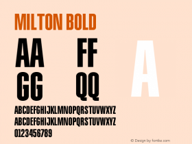
Steve Matteson is the creative type director for Monotype Imaging. A 1988 graduate of the School of Printing at Rochester Institute of Technology, Steve found his passion for type and typography among the historic collections of books, metal type, type-casting equipment and printing presses. In 1990, Steve was hired by Monotype Typography as a contractor to aid in the production of Microsoft's first TrueType fonts. Having already spent more than two years mastering the hinting algorithms of a similar technology for another company, TrueType was an easy transition. He produced fonts for customers such as Apple, Hewlett-Packard and Microsoft. Working on the technical aspects of type has helped Steve fuel his ambition to design new typefaces. One of his early projects was a revival of Frederic Goudy's Truesdell design, completed in 1993. These were quickly followed by the Andalé screen font design for mainframe terminal emulation, in addition to the Blueprint, Fineprint and Goudy Ornate typefaces, as well as user interface fonts for the original Xbox, the Windows Vista platform and Android OS. Some of Steve's more recent creations include Endurance, Miramonte and Bertham designs.
About Tom Rickner
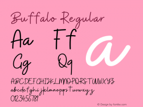
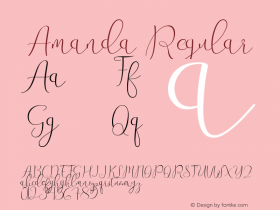
 Tom Rickner has developed font software for over 20 years, producing custom font solutions for companies such as Adobe Systems, Apple Computer, Hewlett-Packard, IBM, Lexmark, Lotus, Microsoft and Nokia for implementation in nearly every imaging environment. A graduate of School of Printing at the Rochester Institute of Technology, he is recognized for the highly regarded TrueType production and hinting of Matthew Carter's Georgia, Verdana, Tahoma and Nina typeface families, commissioned by Microsoft. His experience with non-Latin scripts is broad, having designed fonts for Greek, Cyrillic, Hebrew, Thai, Thaana and Cherokee scripts. His original type designs include Amanda, Buffalo Gal, and Hamilton, and his newest typeface, Rebekah Pro, is a wonderful revival and expansion of Morris Fuller Benton's Piranesi Italic.


 闽公网安备35010202000240号