


A conversation with Rob Leuschke

 For over 25 years lettering artist Rob Leuschke has produced a wide array of elegantly crafted typefaces; from stately formal scripts to more expressive handwriting-based designs, Rob's calligraphic acumen is evident throughout the typographic oeuvre released through his TypeSETit studio. Having both taught calligraphy across the world, as well as created over 200 fonts over his career, Rob recently shared with us some insight into his practice:

Personal design luminary
I have several; John Stevens, Michael Clark, Hermann Zapf, to name a few.
Favorite era of design history
For typographic design, the classic faces of the 18th century comes to mind, but I think present day is the most exciting with all the diverse work coming forward.
Learned to design type
Having more of a hand-lettering background, I'm self-taught using computer software.
Design mentors
My graphic design professor at Mizzou, William Berry. He saw my potential and love for calligraphy and pushed me into hand lettering even though I wanted to be a graphic designer. Berry passed away in 2010.
Longest a typeface has taken to design
It's been 3.5 years on a font family that still isn't finished. It's a book face with which I am less adept. I may never release it.
Shortest time to design a typeface
Babylonica took me about 2 days. That's because I did the work on watercolor paper, scanned the images in and had few adjustments to make on the glyphs. Most fonts take weeks.
Favorite typographic resource
It used to be publications like U&lc. But really, there is so much to see on the web. The Type Studio, for example. Or just do a search, it's all there.
Habitually challenging glyphs to design
I often have trouble with the uppercase J because it seems to lack character for me, but it really depends on the font.

Favorite pursuits outside of type design
I play a lot of Texas Hold 'Em, but I'm not very good, so I don't play for money. I also like to cook (and I AM good at that, but haven't found a way to make money at it). I recently began brewing my own beer; some brews are good, and others are not so much. I'm sure there's no money in it for me [laughs].
Typefaces folks might know you for
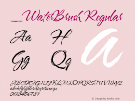
Corinthia, MonteCarlo, Allura, Waterbrush, Inspiration, Love Light, Passions Conflict.
Favorite type classification to design
If you know my work, you know I'm most comfortable with calligraphic designs and contemporary scripts.
 Percent of type design that's art vs. percent that's science
Certainly mathematical science plays a part, especially in traditional book designs, but personally, I rely on the hand-lettering-design side for my work. If I had to give percentages for my work: 10% science, 90% art.
Your typeface families that pair especially well
I think you can take nearly any of my calligraphic scripts and pair them with a very Roman serif like Gideon. MonteCarlo is also quite nice with any sans serif face.
Most underrated letterform or glyph
For me, it has to be the ampersand. There are so many design possibilities, from the simple "et" to crazily swashed treble clef.
Aspiring type designers should possess
It helps to be OCD [joking]. You absolutely must have patience, extreme attention to detail, and a complete love for letter forms.

What typeface classifications should they study?
I think it's best to study the historical forms first. Go all the way back to the ancients to learn why or how forms evolved.
Favorite medium to see your typefaces
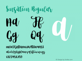
It's fun to see my work on television. York Peppermint Patty uses Ambiance for its slogan, "Get the sensation!"
Endeavors which hone type design skills
Gosh, that's an interesting question. I'm not sure how it really translates, but I like to watch well made films. I enjoy trying to understand how or why a director did a shot a certain way. I suppose that falls under the category of style, or attention to detail.
Most egregious typographic error in common practice today
Since I do mostly scripts, I think it's important not to overwork swashes, and keep in mind that the end-user may not use the same character sets for which you are designing a swash. Ascenders and descenders can often crash into other characters if you are not careful.
Also, I think curves should be smooth and elegant rather than contain pinches or abrupt changes in direction. A form should look like it was drawn with a french curve, without forced changes in direction. The exception is when ALL of the curves have these anomalies, which makes them an intentional design decision.

Ryan Arruda is the Web Content Strategist at Monotype Imaging. Ryan holds a bachelor's degree in film studies from Clark University, and an MFA in graphic design from RISD.


 闽公网安备35010202000240号