


Paulette's Original Donuts & Chicken


Source: http://paulettesoriginal.com.License: All Rights Reserved.
Paulette's is a fried chicken and donut shop in Toronto.
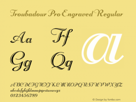
It is a shame the designer for Paulette's used shoddy free-font versions of classic old typefaces when much better digitizations are available. They could benefit greatly by using Troubadour Pro Engraved instead of Beachman Script, and LTC Nicolas Cochin instead of Cock. By using the better digitizations, they would experience far fewer problems like the huge space between V and E in "EV ENTS" on their website, or the noticably uneven curves in their logo.
I was unable to identify the other script used on Paulette's website. If anyone recognizes it please feel free to share.

Source: http://gliha.blogs.com.License: All Rights Reserved.

Source: http://www.the-food-files.com.License: All Rights Reserved.

Source: http://www.flickr.com.License: All Rights Reserved.

Source: http://www.postcity.com.License: All Rights Reserved.

Source: http://www.flickr.com.License: All Rights Reserved.


 闽公网安备35010202000240号