


Romantik & Mittelalter


Source: http://www.fernkopie.de.Fernkopie. License: All Rights Reserved.
In the exhibition The Romantic Middle Ages. Architecture and Nature in Painting after Schinkel, the Alte Nationalgalerie in Berlin presents …
architectural paintings connected to and from the period after the painter and architect Karl Friedrich Schinkel. Architectural painting experienced a surprising revival in the first half of the 19th century which was triggered by the fact that medieval architecture itself had become charged with a highly emotional significance.
smb.museum
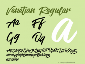
Fernkopie designed the visual identity for the exhibition. The typeface is John Downer's fascinating Vendetta, which, according to its author, is "not a historical revival", but "instead an indirect but personal digital homage" to the Venetian Old Style. The designers made full use of the family. For the title, the Bold is interrupted with a dynamic cursive ampersand. There are small caps and both oldstyle and lining figures. The English text in the leaflet is set entirely in the wonderfully angular Italic.
The Vendetta, too.

Source: http://www.fernkopie.de.Fernkopie. License: All Rights Reserved.

Photo: Florian Hardwig. License: All Rights Reserved.

Photo: Florian Hardwig. License: All Rights Reserved.

Photo: Florian Hardwig. License: All Rights Reserved.

Photo: Florian Hardwig. License: All Rights Reserved.

Photo: Florian Hardwig. License: All Rights Reserved.


 闽公网安备35010202000240号