


David Bowie is the Subject


Source: http://www.creativereview.co.uk.License: All Rights Reserved.
Catalog for the David Bowie exhibition at Victoria and Albert museum London, designed by Jonathan Barnbrook's studio, and set in Albertus and Barnbrook's Priori Serif for body text.
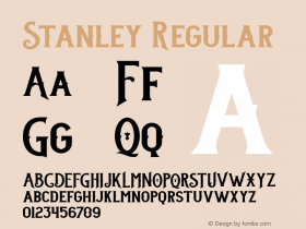
Designer Jon Abbott on the type choice: "There are a number of reasons for choosing Albertus as the headline typeface. London plays a pivotal role in the story told by the exhibition and we wanted the book to speak the language of London without resorting to Johnston (as fantastic as it is). Albertus seemed like an appropriate alternative: it is used on the street signs in Lambeth, the borough in which Bowie was born. Furthermore, Albertus was commissioned by Stanley Morison (creator of the quintessentially British Times New Roman) and designed by Berthold Ludwig Wolpe (German born, British designer), so the Anglo-Germanic history drew a nice parallel to Bowie's time in Berlin."
Read on on Creative Review.

Source: http://www.creativereview.co.uk.License: All Rights Reserved.

Source: http://www.creativereview.co.uk.License: All Rights Reserved.

Source: http://www.creativereview.co.uk.License: All Rights Reserved.

Source: http://www.creativereview.co.uk.License: All Rights Reserved.

Source: http://www.creativereview.co.uk.License: All Rights Reserved.


 闽公网安备35010202000240号