


TDC2 2009 | The Text Faces


After the involuntary extended delay in publishing here's the second instalment of the Display Faces – nonetheless never fail to impress. Designing typefaces for body text has so many constraints. How far can you let the shape of any given character diverge from the standard before it starts hindering the reading process? Erik Spiekermann once told me type designers have a leeway of about 5%, and I am always amazed how much creativity these meagre 5% allow for. Judge for yourself.
Again, keep in mind a lot of this post is (restructured) existing texts sent to me by the designers of the typefaces.
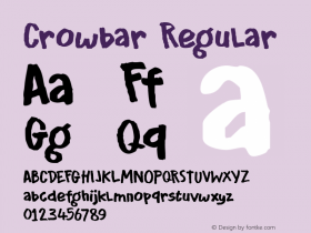
Alda
Berton Hasebe| USA

I am always a bit wary of high-concept type designs. Make no mistake, I really do like it when there is substance behind the shapes, when (new) ideas are explored and successfully translated into a typeface. Yet it happens just as often that in the hands of lesser designers either the concept ends up being crowbarred into the design, or the novelty of the concept gets in the way of good design. There are also times where I get the impression the concept is used to detract from the typeface actually looking dodgy. Fortunately none of this is the case here.

I was very happy to discover Type & Media student Berton Hasabe's Alda amongst the TDC2 winners, as his design is a exquisite marriage of concept and form. The exploration of how a typeface's weight may be represented beyond the width of a stroke results in a delightful suite of three weights, from a lithe light to a chunky, angular bold. By changing details specific to each weight, Berton's intention is to fully emphasize each weight's inherent characteristics, where the bold is robust and sturdy, and the light is delicate and soft. As letterforms reduce, so do these differences in detail, allowing Alda to function as a family at smaller sizes. The goal of this process is to produce a typeface family that is cohesive in appearance under smaller conditions, yet is very expressive at large sizes through its variation in weight and character.
Copte Scripte
Laurent Bourcellier&Jonathan Perez| Typographies.fr, France

Copte Script is a lively and nimble historical script face. After working on a classic, historical interpretation with Ifao N Copte, and a resolutely more contemporary approach with Unicopte, Laurent Bourcellier and Jonathan Perez considered a third possible option for translating ancient writing to digital type, an option which puts cursive writing and the human being centre stage.
The first stage in the Copte Scripte project was to strike the right balance between cursiveness and stability, between faithfulness to the model and abstraction. From the onset Bourcellier and Perez modelled their design on a Coptic papyrus from the seventh century, but also studied numerous models in search for more representative shapes, and to understand structures. They wanted to avoid the pitfall of slavish facsimile, which would not do justice to the rhythm of the document when applied to a type design with only one single shape per character. Bourcellier and Perez tried to produce letter forms, which – when repeated – would approximate the appearance of a hand written manuscript, yet still be sufficiently representative to allow for setting any cursive document.
Another goal in this project was to display cursiveness without continuously resorting to ligatures. Bourcellier and Perez decided to consider that the contrast in downstrokes and upstrokes was created not by the tool itself, but by the pressure applied on it. The resulting vibration is more subtle, and based on their analysis of the gesture, of the ductus in each sign. Finally, instead of using a classic baseline or topline for the characters, Bourcellier and Perez constructed their typeface on a median, which allowed them to energize the writing and remain closer to cursive scripts on papyrus, optimising the word shapes to preserve the vibration of the written lines.
This font offers an alternative for the uncial Coptic writing that is intimately linked to religion and religious documents, to reproduce documents related to everyday life. This allows researchers and publishers to adapt the appearance of any text to more faithfully match the social context it represents. The current version of the font consists of almost 700 glyphs, but it is an open project, and will surely evolve and expand through interaction with the scientific community. It is aimed at researchers and students, but first and foremost at scientific publishers, and is therefore quite complete and conceived to work optimally on professional material.
Expo Serif
Mark Jamra| TypeCulture, USA

An accomplished and very pretty serif face, Expo Serif personally reminds me a smidgen too much of the work of Robert Slimbach and ITC Cerigo, with a subtle whiff of Hermann Zapf. Mark Jamra designed it when over time, and through customer requests, it became clear that a traditional book face was needed in the TypeCulture collection; one that could be used almost everywhere. And the popular Expo Sans™ was in need of a companion serif type. The process of designing Expo Serif Pro began with form trials in 2005 and went through extensive development until production was completed in 2008. One look at Expo Serif Pro reveals that it is much more than merely a clone of Expo Sans Pro with serifs. It was made with the same spirit and expressiveness but not designed to be an identical twin. Expo Serif Pro combines easily with Expo Sans Pro while maintaining its own warmth and integrity.
This typeface can serve in loads of tasks and media. Expo Serif Pro is a typeface family for the professional toolkit, robust enough to perform well in all kinds of uses and processes. Like Expo Sans™ Pro, it is highly readable and has the ability to project a quirk of personality without becoming obtrusive.
Geneo
Stéphane Elbaz| France


Geneo has one of the most beautiful "novelty" lowercase g's I've seen; a surprisingly logical extension of the open bowls on a number of other letters and numbers like the d, p, q, 8 etc. The typeface is a personal project, designed without any particular constraints. The initial idea was to design something between a typewriter slab serif and baroque typographic forms. Stéphane then "normalised" the design in an effort to obtain a more subtle character. While in the process the baroque shifted towards a more humanist atmosphere, some of the initial concept still shines through. Stéphane also opted for a wide range of weights, making the family more flexible.
Ginkgo
Alex Rütten| Linotype GmbH, Germany

Designed by Alex Rütten, Ginkgo is a stylish text typeface. The first sketches were done right after his diploma in spring 2001. Ginkgo has changed radically and frequently during the design process. Rütten's primary interest was to design a font with all his favourite features, giving him the task of finding a balance between contrasting tendencies.
I cannot say that there are no other typefaces already covering the intended uses of the Ginkgo. My goal was simply to design my own favourite typeface. I was inspired by my immediate surroundings – by graffiti and tagging, by organic shapes like leafs and twigs – and of course by other type designs.
Ginkgo is a serif family specifically designed for the setting of long text passages as in books or magazines. One of Rütten's goals in designing the Ginkgo family was that it should work in small and medium sizes just as well as when used big – in posters, packaging etc. It's in these large sizes that its individuality shines.
Ginkgo contains most of the characteristics of a dynamic antique. It is clear in appearance, and has formal details that remind of twigs and trees. With its low stroke contrast it is perfectly legible in very small sizes or under adverse conditions, something Rütten thinks is important in a text face today. The serifs are constructed asymmetrically, lending the characters a dynamic appearance. Alternating smooth and sharp stroke endings give an impression of playfulness, a slightly hand crafted touch. Small gaps in the bowls of letters such as "P" or the lowercase "q" are derived from traditional designs.
Haptic
Henning Skibbe| Germany

Several considerations lie at the basis for Haptic, the typeface Henning Skibbe designed for his thesis. On the one hand he wanted to develop a sans serif typeface, on the other hand he set out to research with how much "character" a design can stand before it starts affecting legibility. This character is determined by many factors – contrast, serifs, counters, intercharacter space, cap-, ascender-, descender-and x-height, width, line quality, ductus, etc. Haptic is neither cool nor technical; it conveys visual warmth and sympathy, but remains perfectly readable and therefore versatile. From the onset Haptic was planned as a type family. It comes in a wide range of weights, carefully balanced to serve all typographic needs.
The first sketches of Haptic had a too pronounced contrast which was subsequently tempered. Large parts of the typeface were sketched and drawn directly on the computer. In its early development the peculiar ductus attracted too much attention on the characters themselves and distracted the reader. This is why Henning tightened the strokes and reduced the radius of the rounded finials. The final version also sees a widening of the letter forms. Henning diversified the shapes of the counters, giving the different characters more individuality, and making them better distinguishable. The rounded, slightly broadened stroke endings – derived from ink bleed when writing with pen and ink – emphasise the x-height and guide the eye along the text. Pronounced ink traps are featured in both the italic and the roman styles. The terminals are either slightly angular or have a convex swing, similar to those found in analogue writing. The overall impression is soft and friendly.
Hardys
Kris Sowersby| Klim Type Foundry, New Zealand
The classy Hardys is a custom typeface commissioned by Constellation Wines Australia and designed under direction from Parallax Design. Hardys was conceived for the re-branding of Hardys Wines in Australia. The typeface essentially is derived from the logotype, which Kris drew for them. Its sharp finish and details are inspired by "Latin" style typefaces popular in the 19th and 20th Centuries, particularly the British and French styles.
Available for licensing in April 2011.
Lirico
Hendrik Weber| OurType, Belgium

Hendrik Weber's Lirico is a characterful, contemporary text type that is at once elegant and sturdy, charming and reliable. It is the designer's first commercially available type, though it is by no means the work of a beginner. Weber is in fact an accomplished calligrapher and designer with a fine sensitivity to letterforms.
Weber began work on Lirico by creating the italic style first, then matching a roman to it. With the tradition and constraints of seriffed types in mind, Weber succeeds in bringing out a truly original design, without leaning on the work of other 'in-vogue' type designers, as so often happens these days. Specifically designed for texts, Lirico is unabashedly traditional yet pleasantly up-to-date.
Malabar
Dan Reynolds| Linotype GmbH, Germany

Malabar is a type family for extensive text. Its design was developed with a nod toward newspapers. Malabar grew out of Martel, a multi-script design that Dan Reynolds initially created in 2008 on the MA Typeface Design course at the University of Reading. To date, Malabar is just the Latin component of Martel. However, a complimentary Malabar Devanagari is currently in progress, and may be released at a later time.
Malabar's characters are seriffed and of the oldstyle genre. A strong diagonal axis is apparent within the curves. Sturdy serifs help strengthen the line of text in small point sizes, as well as define the overall feeling of the face. Malabar's x-height is very high, a deliberate choice that makes the most important parts of lowercase letters visibly larger in tiny settings. The height of the capital letters is also rather diminutive, allowing for better character fit, as well as eliminating a bit of clumsiness in German, which often includes quite a few uppercase letters. Diacritical marks and additional alphabetic forms required by many Western, Central, and Eastern European languages are naturally a part of the character set, including those needed in the Baltic states, for Romanian, and for Turkish. Malabar's accents are bold and direct, sitting well with their base glyphs.
The family includes three weights, each with a companion Italic. Malabar Regular is equipped with small caps, and both it and Malabar Italic include oldstyle figures. All members of the family have both proportional and tabular-width lining figures, as well as special variants of certain punctuation marks vertically adjusted for all-caps text setting.
Malabar is informed both by contemporary ideas of typeface design (sheared terminals, the wider-drawn s) as well as by 16th-century masters. Malabar Heavy and Heavy Italic are very loud; their blackness almost shouts out from the page. The Regular's wedge serifs become more slab-ish in nature as the letters' weight increases. Martel Heavy and Heavy Italic are best relegated to headline use only. Martel Bold and Bold Italic may be used for text emphasis, a job for which the Heavy is to dark.
Novel
Christoph Dunst| The Netherlands


Christoph Dunst designed Novel in the first place for the use in editorial design – which he thinks shouldn't be too surprising given its name. Yet he also wanted it to work for corporate typography. Christoph Dunst feels most typefaces that are popular for corporate typography somehow feel a bit strong and stiff. This is why he set out to create a design that has a swashy and calligraphic appearance – but still is conventional enough for use in serious applications. He also wanted to have a high contrast in the strokes, referring to writing with the broad nib pen. As Christoph Dunst doesn't like italics with too steep an angle, he decided to opt for a narrow and very upright Italic for Novel.
Serrano
Kris Sowersby| Klim Type Foundry, New Zealand
Designed for the rebranding of Bank of New Zealand (BNZ) under direction from DNA Design. This typeface which gently nods at FF Strada was developed with the following key words in mind: friendly, approachable, easy and helpful. Therefore the proportions are humanist and open with the subtle terminal curves revealing themselves in the bolder weights.
Available for licensing in October 2013.


 闽公网安备35010202000240号