


Typographic Relaunch for Audi


The new 2010 Audi A4 Allroad at the Geneva Motor Show 2009, with the new typography.
If you look closely at some recent print ads from Audi you may discover a subtle typographic restyling. The automotive constructor stopped using the modified Univers Extended called Audi Sans introduced 12 years ago by MetaDesign, and switched to AudiType. MetaDesign – which is responsible for this facelift as well – commissioned Paul van der Laan (Type Invaders) and Pieter van Rosmalen (Caketype) to design the new corporate face for Audi. Both Paul and Pieter studied type design at the KABK (Royal Academy of Arts) in The Hague, The Netherlands.

The previous corporate typeface Audi Sans (a modified Univers Extended, top) and the new Audi Type by Paul van der Laan & Pieter van Rosmalen (bottom)

Print ad for Audi Quattro, Switzerland
Neither Audi nor their CI agency have released an official statement about the typographic relaunch yet. Without knowing their exact motivation I think I perceive the politics of baby steps. The foundation, or may we call it the "chassis", is preserved – character width, grey value, metrics – while the bodywork was refined. And this is very elegant, away from the static towards the dynamic, the high-quality.
: : E D I T : :
Some extra clarification about the new typeface. We have been told that Audi Type was built completely from the ground up. Although its character has indeed been preserved up to a certain point, the character widths and spacing in the new typeface are actually quite different. Normal and Bold are somewhat of a darker colour, and ascenders and descenders are longer than in Univers to guarantee optimal legibility in the smaller point sizes.


One of three covers of the 2008 Annual Report

Detail of the table of contents, from the 2008 Annual Report. Audi Type currently exists in Normal, Bold, Extended Normal, and Extended Bold. Italics are under development, and Greek and Cyrillic will be produced subsequently.
At Typo 2007 MetaDesign's Carl-Frank Westermann explained in great detail the strategy behind the Audi Sound Branding, specifically the acoustic endings of the commercials. By applying minute interferences in the overtones the MetaDesigners lent a higher quality to the two seconds. This scenario seems to work perfectly well for typography as well.
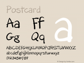
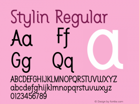
Paul van der Laan and Pieter van Rosmalen will launch their new venture Bold Monday in the near future. At Robothon Pieter handed me a set of very nice postcards with sneak previews of the typefaces. More details to follow, and sooner than you might expect.


 闽公网安备35010202000240号