


Kerning Conference, Faenza (I), 2–3 May 2013


Source: http://www.kerning.it.License: All Rights Reserved.
Posted as part of a little survey about websites for conferences on typography and graphic design – how do these specialist events present themselves typographically, in 2013?
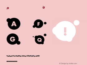
The Kerning website is strongly branded in red and black and a contrasty pair of fresh typefaces: the wide Pluto Sans (sometimes a little light) and the seriffed Adelle (sometimes quite heavy). The layout is responsive. The feedback thingy on the bottom with its gradient speech bubble quickly gets annoying and almost ruins the experience.
Webfonts: ✓ (4 styles via Typekit)
Designer credits: ✗
Typeface credits: ✗

Source: http://www.kerning.it.License: All Rights Reserved.

Source: http://www.kerning.it.License: All Rights Reserved.

Source: http://www.kerning.it.License: All Rights Reserved.

Source: http://www.kerning.it.License: All Rights Reserved.


 闽公网安备35010202000240号