


Customer Spotlight: Ireland.com

Ireland.com is the online presence of Tourism Ireland, an organization marketing the Emerald Isle as a premiere travel destination.
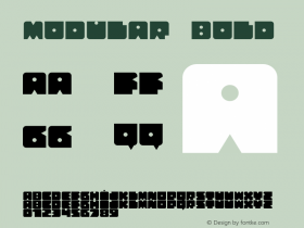
The layout of the Rockwell typeface family nearly exclusively; it's employed not only for headlines, but subheads, body text and primary navigation as well. Italic styles are employed for secondary navigation.

While the heavier weights of this friendly slab serif design from Monotype are strong and sturdy, its lighter weights are excellent choices for body text. A visual complement to layout of the site itself, Rockwell's geometric letterforms mirror the gridded, modular construction present on Ireland.com.
The Rockwell family is available in four weights from light to extra bold, along with matching italics. For further flexibility, the family is also available in two condensed styles as well. Try it for yourself through the subscriptions to the Fonts.com Web Fonts service.
Ryan Arruda is the Web Content Strategist at Monotype Imaging. Ryan holds a bachelor's degree in film studies from Clark University, and an MFA in graphic design from RISD.


 闽公网安备35010202000240号