


Centrefold Magazine, Issue 08


Source: http://www.centrefoldmagazine.com.License: All Rights Reserved.
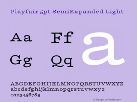
Monotype ModernExtended for their logo and throughout this issue of the print magazine. The turn-of-the-century typeface sets a striking, classical tone for the publication and brand.Monotype Grotesqueis a fitting companion from the same era. The website designers could have simply gone with the webfont version of the typeface (available atPlayfair Displayinstead. Playfair is a fine alternative with a similarly high stroke contrast, and its large lowercase helps it work for the midsized copy on the web, but its readability is really stretched at small sizes. I would consider bumping up the text or using a family like Benton Modern RE that is specifically for screen text.
Source: http://www.centrefoldmagazine.com.License: All Rights Reserved.

Source: http://www.centrefoldmagazine.com.License: All Rights Reserved.

Source: http://www.centrefoldmagazine.com.License: All Rights Reserved.

Source: http://www.centrefoldmagazine.com.License: All Rights Reserved.

Source: http://www.centrefoldmagazine.com.License: All Rights Reserved.

Source: http://www.centrefoldmagazine.com.License: All Rights Reserved.

License: All Rights Reserved.

Source: http://centrefoldmagazine.blogspot.co.uk.License: All Rights Reserved.

Source: http://www.centrefoldmagazine.com.License: All Rights Reserved.

Source: http://www.centrefoldmagazine.com.License: All Rights Reserved.


 闽公网安备35010202000240号