


Kaibosh Website

导语Source: http://www.kaibosh.com.License: All Rights Reserved.The f


Source: http://www.kaibosh.com.License: All Rights Reserved.
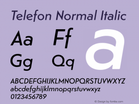
The freshly rebranded Telefon (2012). The Black weight is especially convincing. It's a pity that none of Telefon's lowercase is used – it's all-caps all the way. For the lighter styles, it would have been recommended to increase the letter-spacing. The accompanying serif is Skolar, another fresh typeface (2008). Now if only someone could show the editors how to input a proper apostrophe …

Source: http://www.kaibosh.com.License: All Rights Reserved.

Source: http://www.kaibosh.com.License: All Rights Reserved.

Source: http://www.kaibosh.com.License: All Rights Reserved.

Source: http://www.kaibosh.com.License: All Rights Reserved.

相关字体家族


相关字体设计师

Kaibosh Website 网友点评
Kaibosh Website 最新评论
暂无相关评论


推荐字体资讯

 闽公网安备35010202000240号