


An & Verkauf Fundgrube


Source: https://twitter.com.Jörn Pachl. License: All Rights Reserved.
This reminded me of those TypeCooker recipes that leave you wondering who will ever have a desire for something like "weight: black / width: monospaced / contrast amount: a lot of contrast / stems: slightly concave / intended application: signage / special: initial swashes". Well, here you are.
There are many reasons for having a monospace. Putting vinyl letters on a segmented shop window is not the most obscure one. Too bad when you find out in the middle of the job that the selected font has an extra wide 'F' which by no means will fit. Here the maverick glyph has been replaced by bold Times. Hardly perfect! A pro would have switched to regular Matura with non-swashy capitals. Or, even better, the OpenType version, which has both shapes ready. The font in use in this find, however, is likely the limitedMatura MT Script Capitalsthat ships with Microsoft Office.

License: All Rights Reserved.
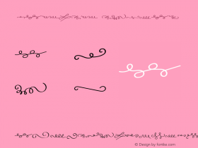
Left: Matura MT Script Capitals. Right: Matura with plain caps


 闽公网安备35010202000240号