


Leaving Here / White Line Fever by Motörhead


Source: http://www.flickr.com.Affendaddy (Klaus Hiltscher). License: All Rights Reserved.
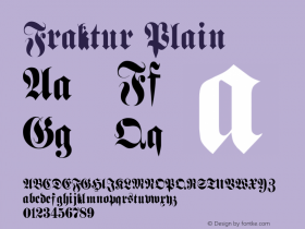
A squiggly floral Fraktur from Bavaria, paired with a stiff and latticed English Textura – strictly speaking, these two blackletter styles don't go together very well. Also, the typography sends out a different message than the photo does. While blackletter in general is often picked to represent roughness, this special selection feels rather cozy or festive, even dulcet. But who cares when the music's loud enough?
Münchner Fraktur goes back to a typeface design by Gustav Lorenz (1850). Lorenz drew inspiration from the type made by Johann Schönsperger for the Gebetbuch for Maximilian I. in 1508–13. In 1885, Heinz Koenig created the related Renaissance Fraktur for Genzsch & Heyse. There are at least three digitizations, Münchner Fraktur by Manfred Klein, Alte Münchner Fraktur by Gerhard Helzel and Neue Muenchner Fraktur by Ralph M. Unger. Apparently it was also available in some form in the 1970s.


 闽公网安备35010202000240号