


Mobile Typography?

From advertising campaigns and user interfaces that build brand to content that tickles the imagination, type is fundamental to the communication process. Typefaces establish hierarchy and evoke emotion; they make products more memorable, entice audiences, command attention and engage the reader.
Everything that type can do on a personal computer, on the Web, or in hard copy, it can also do on mobile devices – and it can do it today. Hierarchy can be brought to user interfaces; typefaces can bring drama and emotion to games and theme-based applications. Type can complement multimedia effects and take the mobile experience to a new level.
Finding the Right Fonts
The best fonts for use in a mobile device, regardless of the application, should have the following attributes:
Ample lowercase x-heightOpen countersDistinctive character shapesModerate contrast in character stroke thicknessRecognizable typeface design traitsMarked contrast between medium and bold weights within the type family
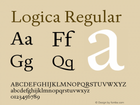
The x-height is an important factor in typographic legibility and readability – especially where screen real estate and available pixels are limited.
Open counters – the white space within letters such as 'o,' 'e,' 'c,' etc. – also help define a character and have a strong influence on ease of recognition. Typefaces with large, open counters are generally considered the easiest to read in hard copy, and this holds true on small digital screens as well.
Individual letter shapes can also affect typeface legibility. For example, the two-storied 'a' is much more legible than the single-storied design, and the lowercase 'g' based on roman letter shapes is more legible than the more simple, gothic 'g.'
Typefaces with strong contrast in character stroke weights do not work well on current mobile devices. There are not enough pixels in this limited digital real estate to reproduce the contrast at small sizes.
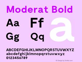
Typefaces that can easily be distinguished from one another are also key for use on mobile devices. They help create communication hierarchy, establish brand identity and enhance a specific visual theme. Typeface families with a marked differentiation between their various weights and proportions also assist in creating hierarchy and logical graphical communication.
Fonts used specifically for operating systems and user interfaces should have exceptionally legible numbers and be available in a range of weights and proportions. They "stand out and fit in," in that they should be distinctive and capable of establishing a brand identity while not being so idiosyncratic that they have a limited use.
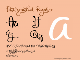
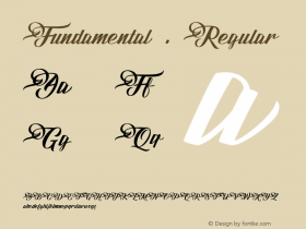
Not all decorative or theme-based typeface designs will be effective on mobile devices. While there will be some trade-offs in small-size communication power for the sake of establishing a distinctive look and feel, the basic requirements of mobile device functionality still apply.
Legibility Requirements
Legibility Requirements
Legibility Requirements
Legibility Requirements
Versatility Attributes
Versatility Attributes
Distinctive Designs

Allan Haley is Director of Words & Letters at Monotype Imaging. Here he is responsible for strategic planning and creative implementation of just about everything related to typeface designs.


 闽公网安备35010202000240号