


National Trust Tree Appeal Poster

导语Source: http://www.davidgentleman.com.David Gentleman. License: A


Source: http://www.davidgentleman.com.David Gentleman. License: All Rights Reserved.
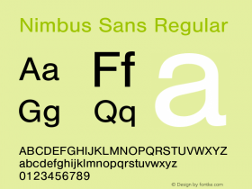
This poster design by fashionable in the 1970s. In case you are looking for a digital font that comes close to this, forget about the ones that are named Helvetica. Apart from the too loose spacing and the differences in the overall proportions, they don't have that restrained exit stroke on 'a'. Better options are Neue Haas Grotesk Display Medium and URW's Nimbus Sans P (Poster) Bold. Latter has the longer ascender on 't'.

相关字体家族


相关字体公司


National Trust Tree Appeal Poster 网友点评
National Trust Tree Appeal Poster 最新评论
暂无相关评论


推荐字体资讯

 闽公网安备35010202000240号