


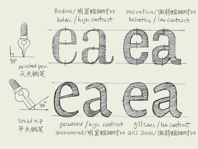
字体设计基础(4)书法原型

Calligraphic origin. The characters on the top line have a different construction than the characters on the bottom line. They have a different calligraphic origin. It doesn't matter if a typeface has serifs (like Times New Roman) or not (like Arial). It's about the original way they where constructed.
图中上下两行字母有着不同的结构,它们来源于不同的书法原型。不管这种字体是衬线字体(如Times New Roman)还是无衬线字体(如Arial),它们的架构都源于它们的书法原型。
The characters in the top line are constructed with a pointed pen (calligraphic tool). The contrast is caused by changing the pressure on the pen, not because of the form of the pen. Bodoni is one example of this, but also sans serif faces like Helvetica have this origin. The thickest part will be (mostly) totally vertical. From this perspective there is no difference between Bodoni and Helvetica. They both have the same construction. Only the contrast varies.
上面一行的字体的书法原型是一种尖头的书法钢笔。其笔画的粗细对比是通过改变笔压来实现的,而与笔尖本身的形状无关。Bodoni字体就是一个例子,但是象Helvetica这样的无衬线体也是来源于此。笔画最粗的部分几乎都是垂直的。从这个角度来看, Bodoni和Helvetica是同出一辙的。它们的架构是一致的,只是笔画的粗细对比有区别。
The characters in the bottom line have a origin which is derived from the broad nip. The calligraphic pen itself has a thick and a thin part. The contrast in the type is made because of the form of the pen, not because of the pressure. You slant the pen with an angle of 30 degrees on the paper. In that way your thickest part of a character will not be on a vertical direction, but will be on an angle. Also the thinnest part will not be on the most horizontal parts. Typefaces like Garamond and Minion have this kind of construction. But also sans serif faces like Gill Sans have a construction which is originally derived from the broad nip.
下面一行字体来源于一种笔尖扁平的钢笔。这种书法钢笔正面宽而侧面窄。字体的笔画粗细是由于钢笔本身形状的差异造成的,而不是笔压。你书写的时候笔身是倾斜的,和纸张形成30度的倾角。因此笔画最粗的部分就不是垂直方向的,而是有一定角度的倾斜。同样的,笔画最细的部分也不是位于水平方向上。Garamond 和 Minion 字体就是这种结构。但象Gill Sans 这样的无衬线字体也同样是起源于这种笔尖扁平的钢笔。


 闽公网安备35010202000240号