


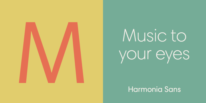
Harmonia Sans: Jim Wasco sets out to design a timeless classic

Jim Wasco loves to talk about type, and when he does, he enthuses equally about highly specific details on the one hand, and the typographic big picture on the other. It's not an either/or discussion – it's a seamless interplay of influences and inspirations. With Wasco, you can indeed have it both ways. His newest typeface design, the Harmonia Sans family, is a perfect example.

The name Harmonia Sans alludes to harmony in two realms, music and typography – and on two levels, the individual and the collective. Each musical note must be 'right' on its own, to ring true with the other notes in the phrase, and it must add to the composition as a whole. (Wasco, by the way, plays jazz piano every week as part of a sextet.) The letterforms of a typeface are even more inter-dependent, in that they must achieve visual harmony in almost infinite combinations. On the 'collective continuum,' Harmonia Sans also blends what Wasco describes as his "favorite aspects of the different sans – grotesque, humanist and geometric" in a new geometric design. He adds, "Harmonia Sans is geometric because the letters are based on a square, circle and triangle, just like architecture."

The alignment comparison above illustrates Wasco's decision to use calligraphic cap to x-height proportions for Harmonia Sans. The ITC Avant Garde Gothic design has a larger x-height, and relatively short ascenders and descenders, while the Futura family has a smaller x-height, with elongated ascenders and descenders. Wasco determined that the calligraphic proportions would serve to increase both legibility and typographic harmony.

Calligraphy instruction sheet from Paul Standard (circa 1950)
Wasco neatly sums up his 'calligraphic lineage': "Dad went to The Cooper Union in the '50s. His calligraphy teacher was Paul Standard, who was a friend of Hermann Zapf's. When I met Hermann, I mentioned Paul – and his face lit up. Many people credit Paul with popularizing calligraphy in America in the '50s." Standard's calligraphy instruction sheet above is based on a cap to x-height ratio of 7.5 to 5.

Calligraphy by Jim Wasco: banner on a piano recital invitation (2007)
Wasco has always favored a ratio of 7:5 for his own calligraphy, and the Harmonia Sans proportion is close to 7:5 as well. Click here to learn more about – and to license – the Harmonia Sans family.

Alyson Kuhn (a.k.a. Kuhncierge) writes frequently about paper and printing, including typography and postage stamps. On occasion, she teaches envelope-folding workshops. She lives in Carmel, California.


 闽公网安备35010202000240号