


字体设计基础(9)可读性

Readability. The only important aspect of a text typeface is the readability. Many decisions can influence the readability. Which contrast you create, the length of the ascenders and descenders, the rhythm, the blackness of a type, the strength of the curves and the bowls, etc.
可读性是正文字体的唯一考量指标。你对字体所做的许多决定都会影响可读性。例如采用怎样的粗细对比,上伸部和下伸部的长度,字体的节奏,黑度,曲线和字碗的力度,等等。
Most of those decision apply to all the characters inside a font. These have to be defined first. For example the contrast. The characters on the top line (see drawing) have a much bigger contrast than the characters on the bottom line. The type on the top line will be more suitable for display use, the type the bottom the bottom line more for text use. Not only because of the difference in contrast, but also because the characters on the top line are much more condensed. This makes them less legible in small sizes, but more eye-catching and flexible for headlines. Defining the contrast and the width are decisions which count for every single character in a font.
大部分的决定会影响到字体中的全部字符。下面这些是应该首先考虑的。比如说粗细对比。图例中上面一行的字符笔画粗细对比明显要比下面一行的要大得多。上一行的字体更适合做特排字体,而下一行更适合做正文字体。不仅仅是因为它们粗细对比的差异,还由于上一行的字符的字宽更小,因而在小尺寸下更难以识别——但是却更能吸引眼球,在制作标题的时候也更具灵活性。所以在定义字体的粗细对比和宽度的时候,要考虑到字体中的全部字符。
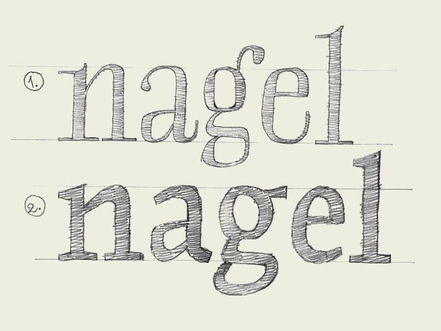
But also while designing every single glyph, you can create details which improve the readability of a font. For example, the ear of a 'g' can make sure the reader's eye will follow the horizontal reading direction more fluently. The 'g' on the bottom line will work much better in a text typeface for small sizes (see drawing).
不过,在设计每一个具体字符的时候,你可以通过增加一些细节来提升该字体的可读性。举例来说,小写字母g右上角的字耳会有助于阅读者的视线更平滑的水平移动。如果用作正文字体,图中下面一行中的"g"在小尺寸下的表现会相当不错。
译注:其实呢,如果按照维基百科的说法,作者这里所说的“可读性(Readability)”实际上应该为“易读性(legibility)”。这两个术语经常被混淆,即使在专业人员中也是如此。
两者的区别,简单说,一般的,“可读性”是用来衡量特排字体(Display Type)的,而“易读性”是用来考量正文字体(text typeface )的。
特排字体一般用来做标题,广告中的特殊排版,其重点在于吸引人进来阅读,让人产生阅读的兴趣,所以排版会比较花哨,以争夺眼球。而正文字体则力求朴素,以各种技术最大限度的增强读者阅读时候的舒适度,降低阅读的疲劳。


 闽公网安备35010202000240号