Dutch euro coins, 2014


Source: http://www.volkskrant.nl.© anp. License: All Rights Reserved.
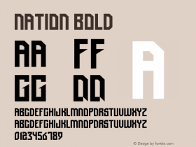
Yesterday, the new design for the obverses of the Dutch euro coins was revealed to the public. It was created by Erwin Olaf — "a great photographer, but a lousy typographer", as Erik van Blokland put it. The coins depict King Willem-Alexander. The text set next to the royal portrait (and in the case of the cent denominations, ungainly across of it) is inDays, designed in 2008 by Ivan Gladkikh and Alexandr Kalachëv under the art direction of Alexey Maslov, and made freely available via Google Web Fonts, among other channels (ID credit Akira Yoshino).
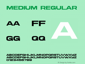
It's highly questionable whether such a bold wide retro-futuristic letterstyle in mixed case is suited for the medium and the topic — and whether it had to be a font (as distinguished from custom lettering) in the first place. Apart from these questions, the Ministry of Finance appears to send two strange messages with this font choice: For this national symbol, it was not possible to find a good domestic type design — in the Netherlands, of all countries! And they didn't want to spend any money on the money, at least not on the type. For the coins representing the country that is esteemed for its valuable visual culture, it had to be a freebie.

Source: http://www.volkskrant.nl.© anp. License: All Rights Reserved.

Source: http://www.volkskrant.nl.© anp. License: All Rights Reserved.





 闽公网安备35010202000240号