


"The anti-shoe" Campaign for MBT


Source: http://kastnerandpartners.com.Kastner and Partners. License: All Rights Reserved.
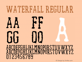
Gibberish copy, but in a lovely black Egyptian — Giza [edit: nope, it'sZiggurat, see comments]. The arrangement is reminiscent of two styles known from type specimen combined — stacked and justified lines, and the waterfall. Ironically, the decreasing type size feels like some higher power is turning down the volume, fading out an annoying carnival barker's voice.
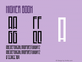
Not only has the very pronounced punctuation of Giza been toned down. For some reason that is unclear to me, the letterforms themselves have been tinkered with, too. Most notably, terminals on 'a', 'f', 'r', 'y' etc. and the ear of 'g' have been rounded.

Source: http://kastnerandpartners.com.Kastner and Partners. License: All Rights Reserved.

Source: http://kastnerandpartners.com.Kastner and Partners. License: All Rights Reserved.

Source: http://kastnerandpartners.com.Kastner and Partners. License: All Rights Reserved.

Source: http://kastnerandpartners.com.Kastner and Partners. License: All Rights Reserved.

Source: http://kastnerandpartners.com.Kastner and Partners. License: All Rights Reserved.

Source: http://kastnerandpartners.com.Kastner and Partners. License: All Rights Reserved.


 闽公网安备35010202000240号