


2009 Penguin Design Award Winners


On June 8, 2009, Penguin announced the winners of the 2009 Penguin Design Award for which students were invited to design covers for Donna Tartt's The Secret History. Peter Adlington won first place for his striking and original design, and second place went to Jia Ying. As the judges were torn over the two very strong candidates for third place, it was jointly awarded to Lucy Pritchett and Edward Essex.
The Penguin Design Award was launched in 2007 to encourage design students on a degree or HND Art or Design course to engage in design for publishing during their studies and to experience real jacket design briefs first hand. Over 260 entries from 62 colleges were received in total this year.
Peter Adlington will graduate this summer from Stockport College with a BA (honours) in Design and Visual Arts. Along with a £1000 cash prize Peter will join the design studio at Penguin on a six week work placement, working with Penguin's Art Directors, Jim Stoddart and John Hamilton, on live briefs.
The judging panel comprised Penguin's two Art Directors, Jim Stoddart and John Hamilton, author Hari Kunzru, and graphic designers Jonathan Barnbrook, Frith Kerr and Amelia Noble. Penguin Managing Director, Helen Fraser, was the chairman.
Helen Fraser commented,
We were extremely impressed with the high standard of entries this year showcasing some very talented graphic designers and illustrators. The final selection of our prize-winners was a tough call and sparked some lively debate among the judges. In the end the decision was unanimous for our winner, Peter Adlington's bold, beautiful and distinctive cover that mirrored the themes of the book in an imaginative and succinct way." Judge, Hari Kunzru commented: "It's beautiful, and the infinite regress doorway tells the story, gives you the mystery in the simplest possible terms, and that's what graphic design at its best can do. Just a few shapes and you have the whole concept.
The winners and runners up attended the award ceremony and exhibition of their entries yesterday night. Today Jonathan Barnbrook tweeted
back from the penguin design awards, dammit why do students always give me hope for the future of mankind?
Indeed, there is some mighty fine work to be discovered amongst the winning and short listed designs, which can be viewed on the Penguin Design Awards website. Now how could I point you to this gallery without quickly looking at the typography in the covers.
1st Place |Peter Adlington· Stockport College
More detail and jury report
The jury report states that "(…) type and the illustration work well together as a unified whole", and Jim Stoddard adds "The way the type makes a logo out of the title and author is expertly done". Yet I must say the hand lettering is not without flaws. Though I really like the modularity and hand crafted quality of the square sans lettering, several characters are in need of optical correction – the A is too narrow, the leg of the R should extend a little more to the right, and the horizontal bar on the H, E, and S need to be raised a touch. Furthermore the spacing is quite uneven, with excess character space around the Ts, and very tightly set HE, HI, OR, and NN combinations.
2nd Place |Jia Ying Gnoh· Staffordshire University
More detail and jury report
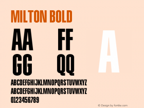
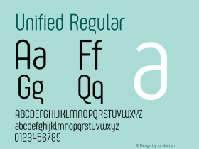
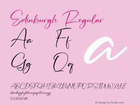
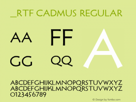
A classic looking cover demands a classic looking typographic treatment. Trajan is an OK choice, but its Roman ancestry clashes a bit with the Greek theme in the design. However using a faux Greek typeface is tricky, as one could easily end up with a cultural stereotype. Personally I'd go for something like RTF Cadmus, Palatino Sans (Informal), Magma, or maybe try Sophia CC.
Joint 3rd Place |Edward Essex· Edinburgh College of Art
More detail and jury report
This design uses a hodgepodge of different serif faces. It starts off really well though, with the book title set in Serlio, an elegant and lively alternative to tired old Trajan which works wonderfully well with the illustration. The author's name in Baskerville Classico next to it is a little too close for comfort – it'd better have been the same face or something quite different. They make a very uneasy alliance on the spine. The distressed serif face MVB Celestia Antiqua was used for the quotes, and Bernhard Modern for the blurb on the back cover. The two latter typefaces make an awkward pairing on that back cover.
Joint 3rd Place |Lucy Pritchett· University of Brighton
More detail and jury report
ITC New Baskerville – though not my preferred version of the old classic – is very well used in this design.


 闽公网安备35010202000240号