Handwriting/Lettering Max Goldt's L'Eglise des Crocodiles

Posting the process video for this month's ScreenFonts reminded me of a similar, equally fascinating clip. It documents the making of the 12-inch sleeve for Max Goldt's record L'Eglise des Crocodiles by graphic designer/calligrapher Frank Ortmann in 2011.
What's exceptional with Frank Ortmann's five minute video is how it reveals the entire process in intricate detail, starting from scratch and ending with the superposition of the lettering on the photography to create the finished artwork. The viewer discovers how ruler guides are drawn, how the lettering is planned and sketched, how the vintage pointed steel pen nib is flame-cleaned, etc. The preliminary practice is an eye-opener – just like a professional athlete Frank warms up by drawing specific lines to get the proper feel in his hand and wrist. If you are not already familiar with this technique, you get a perfect view on how adding pressure to the pen increases the width of the lines when writing with the pointed nib.
Seeing Frank write on top of the sketched lettering poses an intriguing conundrum – is this lettering or calligraphy? The difference between the two is that the former is drawing, while the latter is writing. Frank initially draws the shapes, yet when tracing them you can clearly see the written lines diverge from the pencil lines, so you could argue it actually is planned calligraphy, not hand lettering. What do you think?

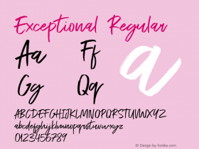
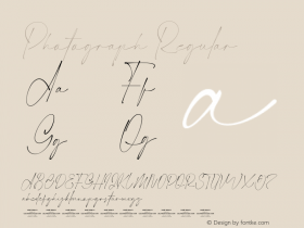
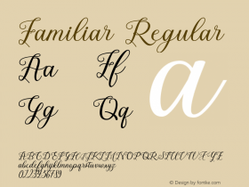
The ability to write so beautifully only comes with years and years of practice. However, thanks to the magic of OpenType and the artistry of a number of phenomenal type designers you can approximate this ornate writing style with digital fonts. Below are some of the best feature-rich copperplate-style script fonts currently available.
P22 ZanerCompendiumBurgues ScriptPoem ScriptBellissima ScriptPennaKrulDulcineaBickham Script





 闽公网安备35010202000240号