


Common Name Website


License: All Rights Reserved.
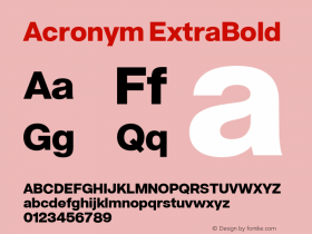
This is one of the rare occasions (or maybe even the first time) I see Monotype Grotesque used as webfonts on a website. I like this typeface a lot, especially for all the inconsistencies across weights and styles, and I think it fits Common Name, a graphic design studio based in New York, very well.
The tricky thing about the used Bold style though is the protrudingly large capital letters (less so in the lighter weight that is used for captions). The spacing is rather loose, as the fonts were probably once meant for text sizes. Both of these features together result in quite flickering, uneven looking text (at least on my retina display). As we see in the acronym-and name-heavy copy here, this is especially problematic in texts where a lot of words begin with a capital letter, like for instance in German. I never noticed this this pronouncedly when I saw Mono Grot Bold in print.

License: All Rights Reserved.

License: All Rights Reserved.

License: All Rights Reserved.

License: All Rights Reserved.


 闽公网安备35010202000240号