


L'Histoire du Diable


Source: http://studiohetmes.nl.Studio Het Mes. License: All Rights Reserved.
Facebook campaign. A set of intertitles with quotes, numbers and pictures related to the play are mixed with selfies from the theatre group.
Visual identity for music theatre group Ausdauer. L'Histoire du Diable is a remake of Strawinsky's l'Histoire du Soldat (1918). The play is situated in a smoky bar in Paris, right after WWI. A group of soldiers play an alienating mix of Strawinsky, Jazz, marching music, as the innkeeper tells her story. She was there when things went wrong in WWI. Moreso, she was decisive, maybe she was the devil in person. Or so she claims.
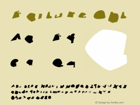
Describing events instead of actually showing the action onstage was the starting point for the posters, flyer and a small facebook campaign. A dadaïst lettering for the title is paired with vernacular, centered typography. The big words under the title say: "Funny. Macabre. The show you visited after all". In referral to silent movies, a set of dialogue cards were made for Facebook. The cards show grotesk facts and numbers from the Big War, cameos from the play and newspaper quotes.

Source: http://studiohetmes.nl.Studio Het Mes. License: All Rights Reserved.
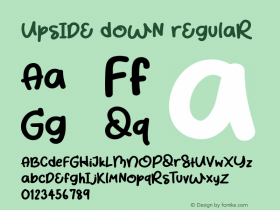
Poster (above) and flyer (below). Failure and mistakes play a major part in the text. In print, half of the message is printed upside down. A failure with advantages: The poster is complete, whether theatres stick a date sheet on the poster or not, and the flyer is readble in any position.

Source: http://studiohetmes.nl.Photo: Studio Het Mes. Studio Het Mes. License: All Rights Reserved. Artwork by Studio Het Mes.


 闽公网安备35010202000240号