


Berliner GenussWerk


Florian Hardwig. License: CC BY-NC-SA.
Octantthat I have spotted in the wild.
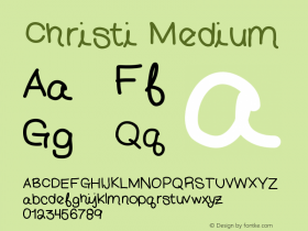
Unfortunately, someone forgot to remove the 's' counters in the vinyl-cut logo — cf. the version on the website. The accompanying monolinear slab is similar to a number of typefaces, but I couldn't find a perfect match yet in regard to the 'R' and the numerals.
According to its designer, Octant is "a steampunk humanist serif … inspired by Victorian brass-and-steel engineering as well as blackletter ornamentation". One can trace how the font came into being on Typophile's Critique forum. There and also on Typedrawers, Christian Thalmann's debut was praised for its interesting and inventive letterforms by several experienced type design colleagues.

Florian Hardwig. License: CC BY-NC-SA.

Florian Hardwig. License: CC BY-NC-SA.

Florian Hardwig. License: CC BY-NC-SA.

Florian Hardwig. License: CC BY-NC-SA.


 闽公网安备35010202000240号