


Futurama Opening Title Sequence


License: All Rights Reserved.
Main title animation from Season 1 (in SDTV).
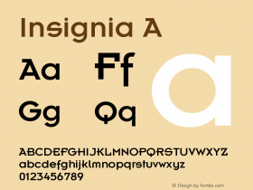
The opening titles for science fiction animation seriesITC KabelandInsignia. All these styles have a similar Art Deco influence as those typefaces found in Disney's Tomorrowland theme parks.
Why are Art Deco-inspired fonts so often employed for futuristic subject matter? Perhaps because the science fiction comic books and modernistic products of the 1920s–40s are the most endearing visual references to popular ideas of what the future might be. Or maybe it's simply that these geometric, mechanical designs reflect the kind of machine-made world we assume is inevitable.
In Futurama's case, the retro-futuristic titles are a callback to a pavilion at the 1939 New York World's Fair that inspired the series' name. Designed by Norman Bel Geddes, the GM's brochure for the attraction is set in Kabel, the predecessor to the ITC Kabel used in the TV series' credits.

License: All Rights Reserved.

License: All Rights Reserved.

License: All Rights Reserved.

License: All Rights Reserved.

License: All Rights Reserved.

License: All Rights Reserved.

License: All Rights Reserved.
Main title from later seasons in HDTV.


 闽公网安备35010202000240号