


Ditchling Museum of Art & Craft


Source: http://www.flickr.com.Photo: Phil Baines. © Phil Baines and Ditchling Museum of Art & Craft. License: All Rights Reserved. Artwork by Phil Baines.
Gill Sans. Its current digital version (black) with the Ditchling Museum of Art & Craft's version (red). Redrawn characters by Phil Baines & Natalie Braune by kind permission of Monotype.
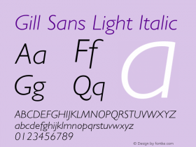
The regular seeks to restore the original metal versions of selected characters; the light and bold are are an experiment on our part, no precedent for this consistency across the weights of Gill Sans exists as far as I know.
A new comprehensive identity for the Ditchling Museum of Art & Craft in the UK.

Source: http://www.flickr.com.© Phil Baines and Ditchling Museum of Art & Craft. License: All Rights Reserved.
The first public appearance of the new namestyle was in press ads in the Museums' Journal, March 2013. (The website URL is the old one).

Source: http://www.flickr.com.© Phil Baines and Ditchling Museum of Art & Craft. License: All Rights Reserved.
Stationery.

Source: http://www.flickr.com.© Phil Baines and Ditchling Museum of Art & Craft. License: All Rights Reserved.
East window vinyl. With a name on the building suddenly everything seems real. Installation 11 September 2013. Graphic contractors were BAF Graphics.

Source: http://www.flickr.com.© Phil Baines and Ditchling Museum of Art & Craft. License: All Rights Reserved.

Source: http://www.flickr.com.© Phil Baines and Ditchling Museum of Art & Craft. License: All Rights Reserved.
Writing the menu just prior to opening to the public 21 September 2013. Photo: Jackie Baines.

Source: http://www.flickr.com.© Phil Baines and Ditchling Museum of Art & Craft. License: All Rights Reserved.
First drinks in the café, the logo looks good on the till roll I think.

Source: http://www.flickr.com.© Phil Baines and Ditchling Museum of Art & Craft. License: All Rights Reserved.
Crockery supplied by the Big Tomato Company.
Source: http://www.flickr.com.© Phil Baines and Ditchling Museum of Art & Craft. License: All Rights Reserved.
Manifestations on the glass panels and doors are the '+' in Gill Sans Light from the logo used as a kind of shorthand.

Source: http://www.flickr.com.© Phil Baines and Ditchling Museum of Art & Craft. License: All Rights Reserved.

Source: http://www.flickr.com.© Phil Baines and Ditchling Museum of Art & Craft. License: All Rights Reserved.

Source: http://www.flickr.com.© Phil Baines and Ditchling Museum of Art & Craft. License: All Rights Reserved.
Graphics panel detail.

Source: http://www.flickr.com.© Phil Baines and Ditchling Museum of Art & Craft. License: All Rights Reserved.
All disks are Arizona printed on Valchromat.

Source: http://www.flickr.com.© Phil Baines and Ditchling Museum of Art & Craft. License: All Rights Reserved.
All nameplates and direction signs are Arizona printed on Valchromat. While exhibition graphics are fixed with hidden fixings, these are face-fixed as though part of the building. It seemed a pragmatic decision for a building concerned with arts & crafts.

Source: http://www.flickr.com.© Phil Baines and Ditchling Museum of Art & Craft. License: All Rights Reserved.
Leaflets and feedback card. What's on and General leaflet designed with Natalie Braune.

Source: http://www.flickr.com.© Phil Baines and Ditchling Museum of Art & Craft. License: All Rights Reserved.
Ticket, What's on and General leaflets. What's on and General leaflet designed with Natalie Braune.

Source: http://www.flickr.com.© Phil Baines and Ditchling Museum of Art & Craft. License: All Rights Reserved.
Cards to announce the opening and initial print work for the museum.

Source: http://www.flickr.com.© Phil Baines and Ditchling Museum of Art & Craft. License: All Rights Reserved.
The 'arra' on this map owes more to London Transport signage than the standard museum 'arra' but works better in this context.

Source: http://www.flickr.com.© Phil Baines and Ditchling Museum of Art & Craft. License: All Rights Reserved.
Checking graphics at BAF Graphics, Earlsfield, prior to installation. Signs are direct to media printed on black Valchromat; exhibition panels on white sprayed MDF.

Source: http://www.flickr.com.© Phil Baines and Ditchling Museum of Art & Craft. License: All Rights Reserved.
Not quite resolved logo from the presentation on 20 November 2012. Part of the whole HLF-funded project was a curatorial refocussing of the museum and this resulted in a new name. The proposed namestyle foregrounds that shift. The + is used instead of 'and' or '&' to reflect the centrality of the catholic guild in all this art & craft. At this point the position, size and colour of 'of' was unresolved, as were other spatial niceties.


 闽公网安备35010202000240号