


ATypI Conference 2009 · Mexico CityTYP09 | The Heart Of The Letter


The previous type conference – TypeCon2009 "Rhythm" in Atlanta – is barely over, and already the type world is preparing for the next one. And it looks like the ATypI organisation has learned some lessons from 33pt. It advertises the upcoming ATypI Mexico – TYP09 "The Heart Of The Letter" – which will be held in the School of Design of Anáhuac University from October 26 to 30, 2009 – with a wonderful motion graphics video.
Promotional video for ATypI'09 Mexico "The heart of the letter"
The promotional video is a presentation by Ricardo Salas Moreno, with concept, screenplay, and motion graphics by Isaías Loaiza Ramírez, Gabriel Martínez Meave, and Alfredo Lezama Osorio. It features an almost exclusively Mexican typeface cast
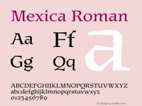
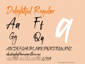
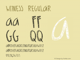
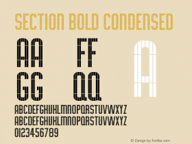
Barricadaby Elí Castellanos ChávezFábricaby Oscar VáñezEnricoby Gonzalo García Barcka & José Luis AcostaLucheta Payol&Pólvoraby Quique OllervidesEl Chamuco & Santaneraby José Luiz Cóyotl MixcóatlProteoby Leonardo VázquezEspinosaby Cristóbal HenestrosaKukulkanby Raúl García PlancarteGaliaby Nadia Méndez GarciaMexinbat Tiypoby various designersNeocodex,Darka,Lagarto,Aztlán,Arcana& TYP09 logo by Gabriel Martínez Meave.
with cameos by
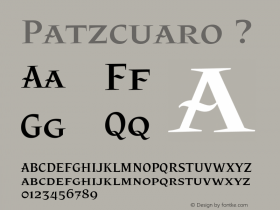
Azteca&Doticby Miguel HernándezPátzcuaroby František Štorm
Some of the typefaces in the promotional video are stunning, and the animation is quite nice, although the text whizzes by a touch too fast in some parts. The video effortlessly blends vintage imagery with contemporary motion typography, transitioning to futuristic bitmap graphics that shift back to traditional fabrics and antique engravings. All this using a splendid colour palette, and against a backdrop of joyous Mexican music – El Sinaloense by Severino Briceño, in a delightful performance by The Kronos Quartet. The sound production is exquisite, with the slightly distorted, vintage sound quality suddenly becoming smooth and clean in the "modern" section (with the fluid motion typography, from 1:55 to 2:10), and some subtle chatter and sound effects at the very end. I love it. It makes me doubly regret I am not attending this edition.
Also on YouTube, this registration of the Caligrafia Gótica e Inglesa workshop by Gabriel Martínez Meave at the Centro Cultural São Paulo, at the Bienal Tipos Latinos 2008. It's fascinating and humbling to witness the apparent ease with which Gabriel draws gorgeous freehand calligraphy. A true master at work.


 闽公网安备35010202000240号