


Lesson No. 1 by Glenn Branca


Source: http://press.morrmusic.com.License: All Rights Reserved.
Lesson No. 1 originally was released in 1980 as the first record on the influential 99 Records. The image above shows the CD cover of the 2004 re-release. The brownish tint of the vinyl sleeve photo below might be due to bad lighting.
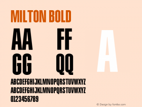
The dimensional-looking letterforms with their implied conical base and strong shading effects are known under various names. The original was called Baby Fat and was designed by Milton Glaser in 1964 [Fat Shadow, without designer credits.
Most digitally available versions carry the nameBuxom, which goes back to an adaptation (or "Facsimile Font original") made by Robert Trogman for FotoStar International in 1975, based on work by lettering artist Herman Spinadel [Keepon Truckin NF by Nick Curtis, who gives credit to Milton Glaser.
The versions vary, most notably in the line width, the design of non-alphabetic characters, and in character set. None of the digital fonts feature the hatched shades for round-bottomed characters that are present in Glaser's original. A comment by Alexander Tochilovsky suggests there was a lowercase, too, which is included in Photo-Lettering's One Line Manual of Styles (1971).

Source: http://www.musicstack.com.License: All Rights Reserved.


 闽公网安备35010202000240号