


Wise Sons Jewish Delicatessen menu


Source: http://www.themessageismediumrare.com.License: All Rights Reserved.
Christopher Simmons of The Message Is Medium Rare:
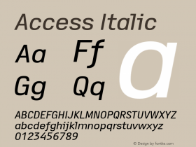
"Like their burger, theCopperplateis the nostalgic standard used for the headings. It establishes Wise Sons in the tradition of the neighborhood deli — proud but unassuming. Refined but accessible. Fastidious but friendly. The descriptions are set inBrandon Grotesque— a Futura lookalike whose rounded corners give it a less authoritarian feel than its '20s-era antecedent. The script,Royal Script, is an unpredictable but inspired choice. Like a garnish it is used selectively (for prices and a few callouts) to provide contrast to the more substantive portions of the menu.
I used to think that Copperplate was an inherently bad typeface. I had a pretty closed mind about Bank Gothic, too, until we finally found a place to (almost) use it. In college I let a friend convince me that Franklin Gothic was ugly. Most designers will tell you that Mistral is an abomination. Mrs Eaves is too nineties. Gotham is too recognizable. Times New Roman is boring. The point is, we are too often limited by what we think we know. Too often we accept rules without testing them (or making them) ourselves. It's generally better to make your mind up about something after you've tried it rather than before."


 闽公网安备35010202000240号