


Jürgen Bulst


Source: http://www.flickr.com.Photo: Florian Hardwig. License: CC BY-SA.
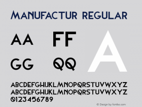
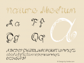
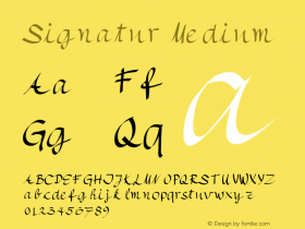
These zestful letterforms are from Georg Salden'sDaphne. It's great to spot this posh typeface in a very down-to-earth use, on the van of a Berlin plumbing and heating service. Typemanufactur.
The letterforms on the van apparently are from the original phototype Daphne: In the new digital version, the split 'r' and the 'u' with distinguishing hook (not an umlaut!) had to go. 'J' has been shortened and counters enlarged, 'g' got a square terminal. The signature swashes are still there, of course — including the terminal 't'. See them all in the Daphne User Manual (pdf).

Source: http://www.flickr.com.Photo: Florian Hardwig. License: CC BY-SA.

Source: http://www.flickr.com.Photo: Florian Hardwig. License: CC BY-SA.


 闽公网安备35010202000240号