


Te & Kaffi identity


Source: http://www.teogkaffi.is.License: All Rights Reserved.
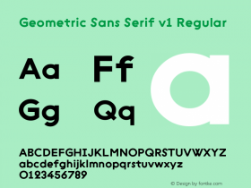
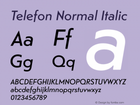
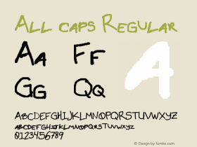
Telefon– a geometric sans serif inspired by the interbellum types found scattered all over Scandinavia, in street signs, posters, machine labels, shops, etcetera – is used for packaging and branding. There is a subtle, but distinct Nordic flavour to it, making it suitable for an Icelandic brand.
Many designers use Telefon in all caps settings, and Te & Kaffi makes full use of the quirkiness of its uppercase shapes. It is also a good fit for Te & Kaffi's product descriptions: its somewhat loose spacing, not so stark geometry and subtle softness to all corners makes it less harsh on the eyes than what is typical for a geometric face.
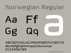
The Icelandic alphabet alphabet contains two letters inherited from Old Norse, the runic thorn (Þþ) and the mediæval eth (Ðð). While these glyphs are supported by all newer quality fonts, they are not necessarily Monokrom takes less-often-used glyphs and well-researched language support very seriously, and this shows when the Norwegian foundry's typefaces are used for small languages with unusual alphabets.

Source: http://www.teogkaffi.is.Te & Kaffi. License: All Rights Reserved.

Source: http://www.teogkaffi.is.License: All Rights Reserved.

Source: http://www.teogkaffi.is.License: All Rights Reserved.

Source: http://www.teogkaffi.is.License: All Rights Reserved.

Source: http://www.teogkaffi.is.License: All Rights Reserved.

Source: http://www.teogkaffi.is.License: All Rights Reserved.


 闽公网安备35010202000240号