


Marsden Hartley: The German paintings 1913–1915 at Neue Nationalgalerie


Photo: Florian Hardwig. License: CC BY-NC-ND.
Poster for the exhibition currently on display at Neue Nationalgalerie, Berlin.
American painter Marsden Hartley (1877–1943) lived in Europe from 1913 to 1915. After spending some time in Paris and Munich he moved to Berlin, where he painted his most impressive works.—visitberlin.de
The typeface goes back to the narrowest offspring of the early 20th century German Grotesk Großfamilie that was available from several foundries, under various names and in varying ranges and flavors, including Aurora Grotesk (C.E. Weber).
Jan Tschichold included these very letterforms in his "examples of objectionable serifless capitals" (in Meisterbuch der Schrift) with a scathing remark: "The M grotesquely distorted, the R undistinguishable: consequences of the extreme condensation." This was in 1952, of course — 20 years after he found them fit for his book cover design for Mensch unterm Hammer.
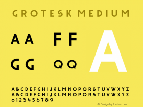
A widespread digital version is Bitstream's Aurora (previously known as Swiss 939) which comes in Condensed and — a much less compressed — Bold Condensed The font in use on the Marsden Hartley poster, however, is Canada Type'sWagner Grotesk(2010). It has both the 'R' with a vertical leg as pictured here, as well as one with a diagonal leg (cf. Aurora Grotesk and Inserat Grotesk in film and metal).
Not only is the typeface a good match for period and place. With its dense pattern, the ultranarrow type is also well suited for putting an image into it.

Photo: Florian Hardwig. License: CC BY-NC-ND.
Detail

License: CC BY-NC-ND.
Aurora Condensed BT (top) vs. Wagner Grotesk (bottom): In the latter, the 'R' with vertical leg is the default. 'L' is wider. There are more differences, e.g. the curvature in 'S' and the apertures ('M', 'N') and counters.


 闽公网安备35010202000240号