USPS signage & identity redesigns (2013)


Source: http://grand-army.com.GrandArmy. License: All Rights Reserved.
The design firmKnockoutandGothamare given center stage in these patriotic renderings. The USPS chose to rework their proprietary boxes with another firm. (GrandArmy also revealed an image of their rejected box design.) The end result falls very much in line with GrandArmy's vision.
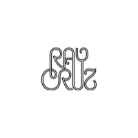
One major element of the postal service's presence has remained wisely unchanged — Muts Yasumura's decades-old logo (which includes a typeface by Ray Cruz).

Source: http://grand-army.com.GrandArmy. License: All Rights Reserved.

Source: http://grand-army.com.GrandArmy. License: All Rights Reserved.

Source: http://grand-army.com.GrandArmy. License: All Rights Reserved.

Source: http://grand-army.com.GrandArmy. License: All Rights Reserved.
Unused proposal for USPS propriety boxing.

Source: http://grand-army.com.GrandArmy. License: All Rights Reserved.

Source: http://grand-army.com.GrandArmy. License: All Rights Reserved.

Source: http://grand-army.com.GrandArmy. License: All Rights Reserved.

Source: http://grand-army.com.GrandArmy. License: All Rights Reserved.





 闽公网安备35010202000240号