


Foundry Focus: Moretype


The success of the Focus On FontStructors mini-interviews – which by the way are becoming less "mini" with each new instalment – made us decide to start a new series. The publication schedule will be adapted accordingly: from now on the interviews with FontStructors appear on a monthly basis, and will be alternated with a spotlight on a type foundry about halfway every month. We kick off this series with the Moretype Type Foundry, the one-man operation of Chris Dickinson.
The number of foundries in the FontShop roster is growing steadily; 81 at this time of writing. Spotlighting sometimes lesser-known libraries will help build appreciation for their diversity and the quality of their offerings. Many type foundries carry a distinct stamp; their typefaces have a specific flavour, so discovering new ones will broaden our typographic horizons.
Moretype | An interview with Chris Dickinson
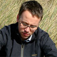
Chris Dickinson graduated from Brighton University with a BA Hons in Graphic Design and was a winner in the Student category at the Donside Graphic Design & Print Awards. Whilst working as a freelance graphic designer he developed his interest in typography and designing type. After releasing fonts through other channels he set up his own foundry, Moretype, to display and distribute his type designs. Chris continues to work as a graphic designer and is currently working on a number of projects for both print and screen. He recently joined the FontShop family with updated versions of four of his typefaces, now available in fully featured OpenType.

When did you first become aware of typography and different typefaces?
I think I first started consciously noticing type and typography at university. I was interested in creating letterforms with modular systems. Modular letterforms were an easy way to create something distinctive before I was introduced to Fontographer and drawing fonts.
My degree course was very ideas led. I was always more concerned with finding new shapes or objects that could be used to construct letterforms rather than traditional typography. All of my type attempts from this period were display fonts with only upper and lower case character sets, mostly unusable. I quickly realised that modular typefaces were limited but I was hooked, and I began trying to design more conventional typefaces.
You say modular type forms are limited, yet I've started interviewing FontStructors this summer and a whole new world is opening up to me. What are your thoughts about FontStruct and the opportunities it offers to type design novices?
FontStruct is a really great application. The site looks good and the drawing of the letterforms is made so simple. Modular fonts are ideal for quick ideas and pixel fonts for flash, but for me, they started becoming limited, and I wanted to create different weights and italics which is always difficult with modular fonts.
For quick concepts or as an initial introduction into font design, applications like FontStruct are a superb way to visualise ideas and learn about creating type.

You graduated from Brighton University with a BA Hons in Graphic Design. How did the shift from graphic design to type design happen?
There has never really been a shift from graphic design to type design. Initially I was drawing letters and later typefaces to use in my own work as headline fonts or logos. As I became more interested in the process of designing type, I started creating fonts that were not directly related to the graphic design work I was doing, but were separate projects to actually design a typeface. I am primarily a graphic designer who spends a lot of time designing fonts.
When did you start up Moretype?
I didn't start my own foundry straight away. My first fonts were released through T26. At the time, I was happy with the fonts I had produced but I wanted to see if other people felt the same. The sales at T26 went well so I was more encouraged to set up Moretype in 2006.

What is your motivation to design new type?
I remember reading quote at university from Jon Wozencroft:
"Ten years ago if you were angry you'd join a band. Today you design a typeface."
I'm not saying I was angry, but this describes one of my initial motivations for designing fonts. My interests always involved graphic design and information architecture, so designing my own fonts seemed like a logical step. I imagine the feeling of hearing a song you wrote is the designer's equivalent of seeing a font you designed being used.
I personally don't have a discontent with what's available, but I do a have a desire to produce professional fonts that are distinctive yet still usable. I don't want to produce typefaces that are unique and have no application, rather type that conforms to existing models while displaying its own character.
Indeed I noticed that the four type families released through FontShop all are very personal takes on typographic archetypes – the tech sans Alwyn offers a welcome alternative to DIN and ITC Conduit; Faricy puts a humanist twist on geometric sans faces like Futura and Century Gothic; Hedley is a modern interpretation of the humanist sans; and Mic 32 is a nice addition to the spurless sans genre made popular by FF Dax, FF Sari, et al.
Alwyn New, Faricy New, Hedley New, and Mic 32 New are all re-releases of fonts that were originally available between 2004 and 2006. I decided to update these typefaces following requests from customers for further features in the fonts such as small caps and different numerals. Rather than just adding the new elements I used the opportunity to completely re-evaluate the fonts. The 'New' OpenType versions are redrawn typefaces with improved spacing and kerning, along with expanded character sets and new OpenType features like small caps, additional ligatures, and several figure sets. I wanted to retain the original character of the fonts, so these families have two sets of influences. Those from when the fonts were first drawn, and then the influences I had when I redrew them.
FontTester with limited character set.
The concept for Mic 32 came from a logo I produced for a furniture designer. I wanted to use a modern, clean, rounded sans, something like Metsys or Elephant by Gareth Hague. Nothing fitted my requirements, so I drew a logo that evolved into Mic 32. When I returned to update the font I think I was more influenced by fonts like FF Dax and Neo Sans. Returning to the fonts has been about refining the original concepts and drawing on new influences that weren't available – or I wasn't aware of – when I first drew them.
FontTester with limited character set.
Hedley was my first attempt at a fully functional sans with a usable character set. My initial ideas for Hedley were influenced by fonts like Miles Newlyn's Modena and Sebastian Lester's Scene. I liked the simple robustness of these fonts, a sturdy feel while still being human. I think Modena's large x-height and short ascenders create a really appealing typeface, I wanted Hedley to have a similar feel.
FontTester with limited character set.
Alwyn began life as a round cornered modular font with angular stems that I drew as part of a logo for a client. The logo called for a treatment that was mechanical and high-tech. The Foundry's Gridnik fitted the brief perfectly, but the logo design required a unique arrangement of combined glyphs. It was easier for me to draw the logo, but it was strongly influenced by Gridnik. When I decided to develop this logo into Alwyn I wanted a more formal feel while still capturing an industrial mood. When I returned to Alwyn I was looking at fonts like the font Fontsmith designed for Channel 4 in the UK, and other typefaces which seemed to appear at that time with the same square roundness.
FontTester with limited character set.
At university I was always drawn to the clean geometric lines of fonts like Futura and ITC Bauhaus. At the time their circular bowls and straight ascenders seemed like a simple blueprint to construct modular letterforms, but I quickly realised it wouldn't be that simple. Faricy was my personal take on this typographical archetype, although the original sketches were more like flattened versions of Mic 32. These preliminary doodles quickly developed into its present form.
What is the next typographic model you plan on tackling?
Revisiting old sketch books for this interview has revealed some forgotten ideas that look interesting – early attempts at script fonts. That could be the next typographic model I tackle.
You released no serif faces so far. Do you plan on trying your hand at them?
My fonts are normally directly related to or influenced by my current graphic design work, I think this is why I haven't attempted a serif face. I am more drawn to designing sans serif fonts, but I'm sure I will make the effect to draw my own serif typeface at some point in the future.

Apart from the direct influences for the typefaces you mentioned, what/who are your main influences in graphic and/or type design? Why?
Influences in my graphic/type design can be wide and varied depending largely on the clients needs and the audience. I think there is a common thread through my influences that was established when I first became interested in graphic design. At the time, I was inspired by designers like Peter Saville and Mark Farrow. Saville's record covers for Joy Division, and later New Order, were my introduction to a modernist approach to graphic design with clean sophisticated typography. Later influences include designers like Paul Elliman and Graphic Thought Facility, whose work was more ideas led, and the intended function of the design was just as important as its visual appeal.
I'm continually influenced by new things, from shopping lists that people leave in shops to new buildings. I think the factors that encompass them all is subtle approach to design, where form follows function.
You said you're "primarily a graphic designer who spends a lot of time designing fonts". How important and pervasive is graphic and type design in your life?
I don't think graphic/type design is the sort of profession you can stop thinking about when you stop work. Whether I'm consciously thinking about it or not, I will always notice type and design. It can be annoying when I'm watching a movie and I'm more concerned with the kerning of the titles than the actual plot. If I'm not working, I am more than likely thinking about type or something design related. When I'm not working, and trying not to think about type or design, I cycle a lot, but that's more to stop me going mad.


 闽公网安备35010202000240号