


Designers Explain Why Apple's New OS X Typeface Is a Strange Choice

It was one of the more subtle changes showcased during yesterday's WWDC keynote: Apple finally ditched its OS typeface Lucida Grande to use Helvetica Neue across the board. Now, at least the OS and iOS systems match. But is Helvetica—which is basically unreadable at small sizes—really a better choice?
The slim, unfussy Helvetica Neue is a spot-on pick for the new OS design in several ways: It is clean and uncomplicated, which aligns perfectly with the quest for flatness that pervades the new interface and icons. And it is a typeface that certainly imbues sophistication and timelessness upon its content—it's a classic font, historically embraced by designers, that has been around for decades. It's pretty!
The Future of Apple Design Is Hidden Inside OS X YosemiteThe Future of Apple Design Is Hidden Inside OS X YosemiteThe Future of Apple Design Is Hidden Inside OS X Y
Today at WWDC, Apple gave OS X a design overhaul that's just as huge as its namesake. Yosemite … Read more Read more
But when it comes to using it on a computer, especially for type that's smaller than a headline, designers seem to agree that Helvetica Neue is a poor choice. "It's just a bad interface typeface," says Frank Chimero. "Low contrast in letterforms, similar shapes between them, at that. Tough to differentiate at small sizes."
Advertisement
Legendary type designer Erik Spiekermann probably explains it best with this essay on Helvetica's problems (bluntly titled "Helvetica sucks"): "It really wasn't designed for small sizes on screens. Words like milliliter can be very difficult to decipher. If you ever had to read or write a password with 1, i, l, or I, you know the problem."
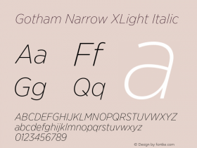
Helvetica also wasn't designed with web functionality in mind. "The use in dropdown menus and buttons doesn't feel as clear and clickable in Helvetica Neue as it did in Lucida Grande," says Stuart Sandler. "The same can be said for Twitter's change to Gotham Narrow which is otherwise a great font but in practice makes Twitter feeds feel less 'readable' and more sterile and directional."
Sponsored
All of this is a pretty big issue, especially when you consider that Helvetica Neue is being used on the teeny tiny screen of a phone. Apple even knows this is a problem because there's a fix built-in to iOS: You can go into your Accessibility settings and switch to "Bold Text," which will toggle your type from Helvetica Neue Ultra Light to Helvetica Neue Light.


 闽公网安备35010202000240号